

Cancer Research UK ignites strong feelings by comparing obesity with smoking

The Background
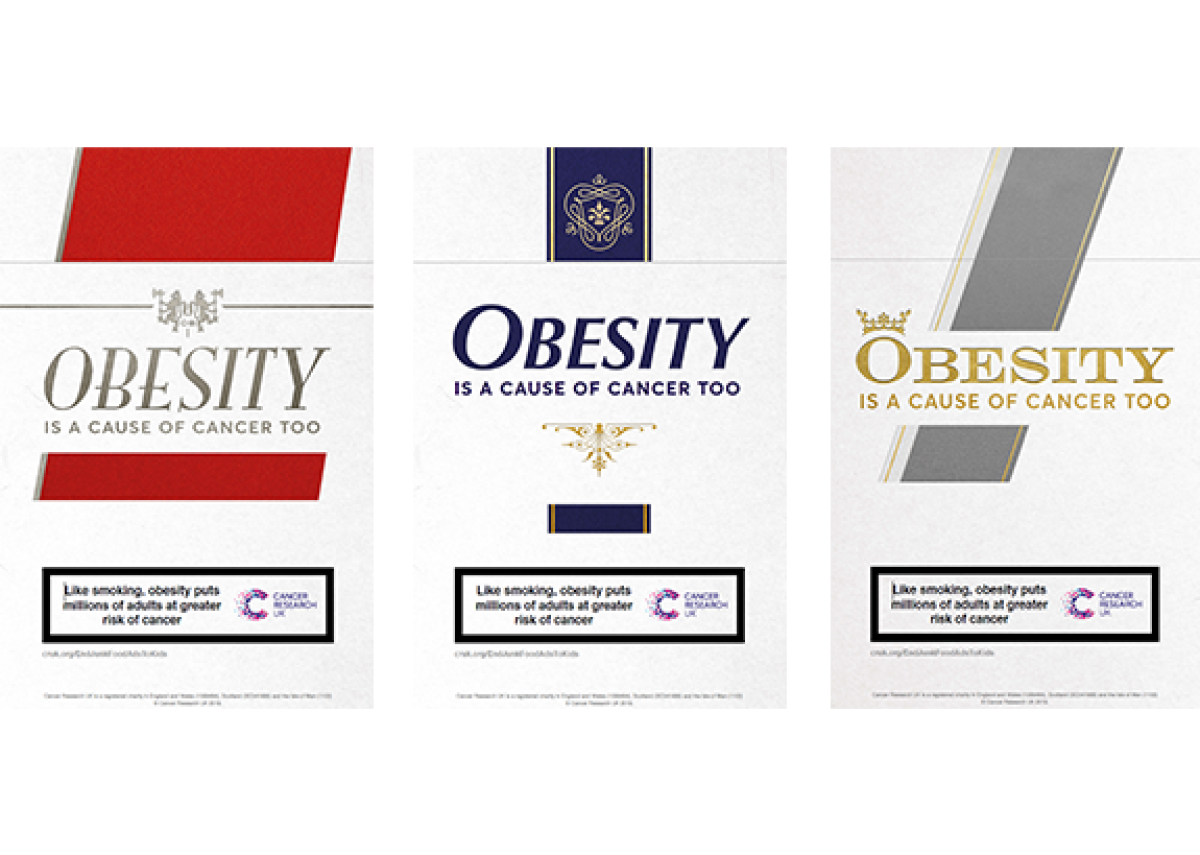
I am sure you’ll have seen the Cancer Research UK (CRUK) Obesity Campaign on poster sites around the country.
It’s been causing quite a stir and it has divided opinion within the industry and with the public.
We all know there’s link between smoking and cancer, but according to Cancer Research UK, obesity is also a cause of cancer, so it developed the campaign to highlight this.
What They Did
Visually, the campaign looks like a strange deja vu of cigarette advertising from the 70s.
It features giant cigarette packs, just as the Benson and Hedges and Silk Cut brands used to do. But the old familiar brand names are now replaced with the line ‘Obesity is a cause of cancer too’.
The reason the campaign has caused controversy is that some say it is unfair to obese people.
In response to the campaign, a petition was sent to CRUK that said “Implying that individuals are largely in control of and responsible for their body size (and therefore cancer) supports a culture of blame and plays into prejudices and negative stereotypes, which drive the social exclusion, marginalisation and inequality of an already stigmatised population.”
But the International Agency for Research on Cancer has stated that extra body fat does increase the risk of cancer. This is an argument I am unqualified to enter, so I won’t.
But I am qualified to look at the campaign from an advertising art director’s point of view. And, from the point of view of someone who, back in the 70s, worked on cigarette advertising campaigns.
The Big Idea
The CRUK campaign is instantly intriguing.
It’s brave to use cigarettes, a now almost taboo product, and possibly CRUK’s ultimate villain, as the star of the show.
The concept is instantly understandable (whether you support the argument or not). It works, even from a distance, say when you’re driving past it on the M4 flyover, as I was when I first spotted it.
The pastiche cigarette packs have cleverly captured that retro Embassy come Silk Cut graphic style.
The Cancer Research health message and CRUK logo fit seamlessly onto the packs, where government health warnings used to be printed.
I do wonder whether these graphic cues will be lost on a younger generation who weren’t around during the last days of cigarette marketing. If a Millennial was to picture a cigarette packet in their mind’s eye, I imagine they’d see a blank, olive green, brand free box, with a grisly picture of a lung on it.
But the graphic cues weren’t lost on me. Seeing that retro style cigarette packaging on a poster reminded me of the vast amounts of money and research that we used to spend on the packaging and the advertising of a humble packet of fags.
Those were the days when everyone smoked. You could smoke on an airline, smoke on the tube, my family doctor smoked like a chimney, it was the norm. And as such, it was just another product that we had to advertise, to encourage the smoker towards our particular brand. Which smoker were you? A Marlborough cowboy, a Dunhill sophisticate or a Camel adventurer? Different times.
Cigarette packs were also designed to encourage brand loyalty. They created an air of sophistication. They were designed to be an accessory.
The Review
I think there’s a similarity between old school cigarette pack design and the way modern-day food is packaged and marketed. Which links back to the CRUK obesity claim.
Just as used to be the case with cigarette packs, the colours, designs and photography used in food packaging are chosen to attract the eye, then the brain, to encourage consumption.
Maybe, to help combat obesity, which in turn may help combat cancer, food packaging and advertising should have similar restrictions placed on it to those that were eventually imposed on cigarettes?
When restrictions were first tried on cigarette advertising in the 70s, it’s worth noting that it was a spectacular failure.The government of the time, in a bid to reduce the appeal of smoking, decided to control the imagery that could be used to promote tobacco, in a bid to make smoking less attractive.
Old-school cigarette ads traditionally featured sophisticated people smoking in beautiful locations. The government’s new rules would change all that.
The Advertising Standards Authority of the time put a mandatory health warning on every advert. Then it banned the use of all aspirational images. It banned images of success, images of attractive people, images that could be deemed of a healthy nature. You couldn’t show sunshine, blue sky, blue seas, green grass, anything to do with leisure, and definitely no imagery that would appeal to children.
All well and good you might think. But as all creative people will tell you: Nothing gets the creative juices going like a restrictive brief…
From that point on, cigarette campaigns started to get lateral. Agencies experimented using surrealist and abstract art as inspiration for their campaigns. The visuals became puzzles that were completely open to the viewers interpretation. To adhere to the new rules, agencies utilised what seemed to be anti-advertising. The public often saw death symbolism in this new style cigarette advertising. Pyramids, mouse traps, moths around a flame, brooding doomy skies. These supposedly off-putting images obeyed the government’s new guidelines, but they didn’t put off the smokers, just the opposite in fact.
Messaging seemed to be appeal to the smokers who had an appreciation of irony, of semiotics and hidden meaning. Suddenly cigarette advertising was flattering a smoker’s intelligence, gaining a smoker’s allegiance in a new way!
In Hindsight
Eventually and quite rightly, all cigarette advertising was banned in the UK, and smoking was banned in public places.
This led to a huge increase in people quitting smoking.
Which brings us back to the CRUK obesity campaign.
If obesity is proven to be a cause of cancer, should the government try to temper our over-indulgence by introducing packaging and advertising restrictions?
Or maybe they could try a ban on eating in public places…
If you enjoyed this article, you can subscribe for free to our weekly email alert and receive a regular curation of the best creative campaigns by creatives themselves.
Published on: