

Feeling the love for the John Lewis & Waitrose rebrand
The Background
Has the UK high street ever been in a worse condition? Nobody is now surprised to hear about yet another closure on the news with House of Fraser the latest victim succumbing to the effect that online shopping is having on the UK’s high streets.
So when two beacons of UK retailing, John Lewis and Waitrose, do their first rebrand in 18 years it’s bound to make people sit up and take notice. This new visual identity encompasses everything from new logo styles, colour palette, typography plus products and services and a very expensive looking joint TV commercial so clearly no corners have been cut in this part of the high street.
The Big Idea
It’s all about democracy. Something we don’t seem to have much of currently with the trials and tribulations of Brexit, but Pentagram, who created the rebrand, has based its whole approach on heritage and the company’s democratic ethos where every employee is a partial owner.
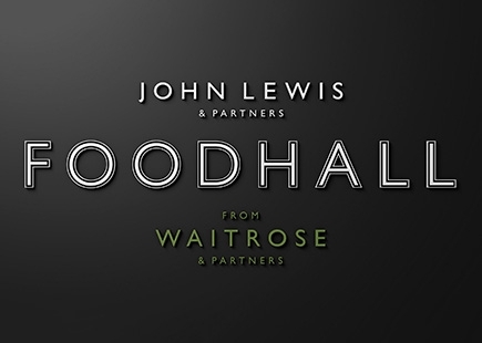
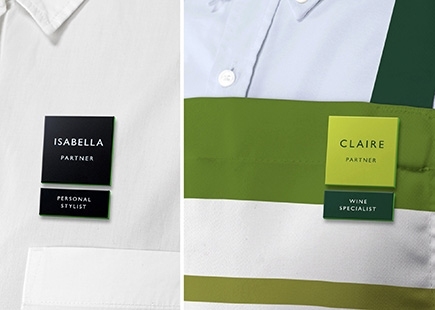
The big idea is ‘partners’. The new brands both feature ‘& Partners’ dominantly in their designs and build on the company’s commitment to the original John Lewis model. With consumers demanding their brands of choice to be more principled and decent, this could be a master stroke. Just bringing to the fore what they have always stood for really gives them a solid base of reliability to build on, and create a modern and engaging visual approach where everything is there for a reason.
With brands coming and going, this timeless feel really hits the mark in my opinion.
What They Did
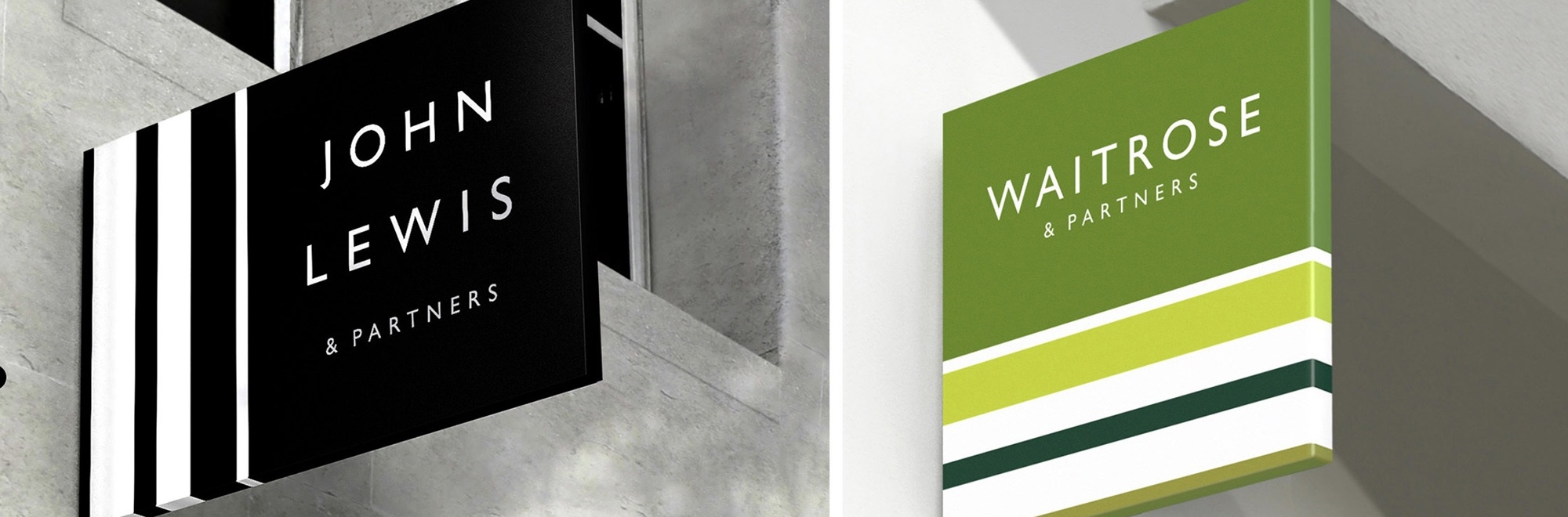
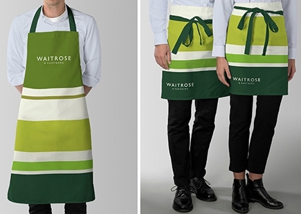
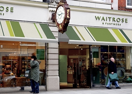
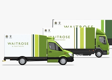
With branches all over the UK, it must have been a logistical nightmare to have everything land at the same time, but that’s what appears to have happened with store fronts, staff uniforms, packaging and even lorries all appearing with the new branding.
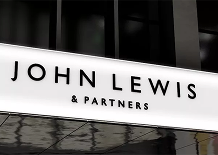
The new brand logos build on the fact that John Lewis started as a haberdasher so the sense of material is evident in the stripes and linear patterns. New colour palettes were devised for both brands and use of one of my all-time fave typefaces Gill Sans, means it gets a very big thumbs up from me. It has style, panache and a sense of modern Britain which I love.
But, (readers of my other columns will know I like a but). The TV ad. Using Bohemian Rhapsody may have been a masterstroke when conceived, but just feels dated now. Unlike the famous John Lewis Christmas TV ads where use of current, or just-under-the-radar musicians has been so successful, really disappointed the new brands weren’t given a modern soundtrack to present themselves to.
Loved the story. Amazing directing and real production values giving a film quality finish, but let down by the music for me.
The Review
We saw last week that John Lewis has seen a record drop in profits slumping 99% for the first half of 2018. Hopefully, this new rebrand will put both brands right back at the top of their prospective piles as they are true examples of the best of British.
Their commitment to quality is what they are both about and sets them apart from their competition. For me this rebrand represents that and is why we British can be proud of these two high street giants. Just a shame the work was done in Pentagram’s New York office!
In Hindsight
Can’t say I would have done anything differently. Loved the work. Loved the fact there was a story and a real reason why every element of the design was there. Yes I know consumers won’t know all of that and will just look at it purely for its aesthetic values, but as a creative I can really appreciate the thinking that went into the approach overall.
If you enjoyed this article, you can subscribe for free to our weekly email alert and receive a regular curation of the best creative campaigns by creatives themselves.
Published on: