

Creative Director's Cut: Sarah Cooper 'doing' Trump, No Experience Needed for McDonald's and Liberty's rebrand

So, what made the cut according to our community of creative directors?
Here are the top campaigns and creative work they admire this week...

#Cut 1: Sarah Cooper lip-syncs to Donald Trump
Mark Perkins, executive creative director, W Communications
I'm struggling to find many positives as a result of lockdown except, perhaps, that QPR had to suspend their season.
At the beginning, as we hunkered down in fear and uncertainty, there was a sort of cultural prolapse of earnest creativity on social media. This included A-listers from Hollywood deciding what we all needed for comfort in isolation was a montage rendition of 'Imagine' which was enough to make one consider booking a one-way ticket to Wuhan and be done with it.
By far the most fantastic thing to emerge in isolation - and as a result of isolation - is Sarah Cooper and her online lip-syncs to the verbal diarrhea of Donald Trump.
In March she was an unknown actor experimenting with TikTok in her apartment, using household objects as props to accompany her facial and physical tics and rapid jump cuts. Today, she is an internet phenomenon that has broken into mainstream TV. Cooper is not the first to 'do Trump' but she's the first to nail him. High-profile actors and comics have fallen down the rabbit hole of donning the wig, doing the voice and gestures, and being nowhere near as absurd and scary as the rambling, delusional reality.
Cooper's brilliance is to simply let us hear Trump talk.
The puffed-up vanity, buffoonery, insecurity, leaps from one random diatribe to another and rapid departure into surreality is as hilarious as it is discomforting. With the optics and theatre of the Presidency stripped away, she exposes him for what he really is: the self-important, bitter, paranoid guy you want to avoid at the end of a bar or bus stop. The creepy Uncle everyone avoids at a wedding. You are watching Cooper, laughing and then you remember who is doing the talking, 'Oh, fuck, THIS is the President of the United States of America?'.
There's no sign of her material drying up anytime soon.

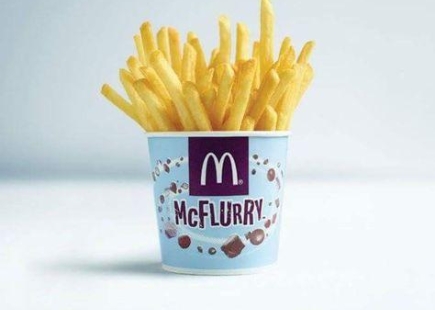
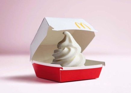
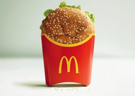
#Cut 2: No Experience Needed for opportunities at McDonald's
Ravi Beeharry, creative director, Five by Five Global
"One day you’ll end up just working in McDonald’s, flipping burgers". It’s a motivational threat I’ve heard many a time.
Why are we so quick to knock big brands like McDonald’s and turn up our nose to those that create so many employment opportunities?
I love McDonald’s. The brand, the food, the lot.
My brother worked at McDonald’s. It was his first job (like it is for lots of people) and to this day (20 years later) he still has fond memories and is not ashamed to say he worked there.
With unemployment set to rise, it’s companies like McDonald’s that will step-up and offer thousands of opportunities to those who seek employment.
And they’ve always been doing this. Opening their doors to all. That’s what I love about this campaign from TBWA Belgium. It’s that’s sense of inclusion regardless of experience.
There are not many companies that are proud to say ‘no experience needed’.
The work is clean and simple but super impactful. It celebrates inexperience with a warm welcoming hug.
Bravo. I really am loving it.

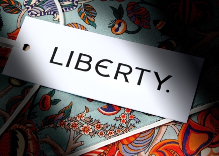
#Cut 3: Liberty's rebrand appeals to a new generation
Ala Uddin, executive creative director, mudorange
In recent years, luxury fashion houses have followed a trend of typography-led brand identity refreshes. Luxury fashion brands such as Burberry, Yves Saint Lauren, and Calvin Klein are opting for a minimal yet bold aesthetic, as opposed to a superfluous and dense design articulation.
This is why I was struck by the redesign of Liberty: it successfully injects an idiosyncratic personality that carries the brand’s flair whilst converging with effortlessly modern and sleek execution.
Crafted from the original sign that hung above the iconic Great Marlborough Street store, the new logotype successfully looks backwards to move forward, intricately linking Liberty’s new identity with its heritage and history.
Using the letterforms from the new logo, the fresh brand identity includes a custom typeface, Lasenby Sans, named after Liberty’s founder. For me, Lasenby Sans’ confident edges combined with its subtle angles successfully reflect the brand’s eccentricity; whether a bold minimal mark on labels or a repeated pattern on posters, the typeface works effectively across packaging, artwork, and fabric prints.
Liberty’s new brand identity succeeds in celebrating Liberty’s charisma while keeping up with the modern landscape of luxury fashion brands and is an elegant concoction of design that successfully marries tradition, craftsmanship, and modernism.
If you enjoyed this article, you can subscribe for free to our weekly email alert and receive a regular curation of the best creative campaigns by creatives themselves.
Published on: