


New brand identity for ocean-plastic-fighting Seven Clean Seas
78 million tonnes of plastic packaging flows into our oceans every year. This is the equivalent of pouring a rubbish truck’s worth of plastic into the oceans every single minute.
Now, Seven Clean Seas has been relaunched with a utilitarian, hardworking, workman-like design that matches the urgency of the problem we face.
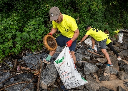
Seven Clean Seas (SCS) is a social enterprise that literally pulls plastic out of the ocean for a living. This is not to be mistaken with “ocean bound plastic”, which tends to be plastic retrieved from locations within 50km of the coastline. SCS remove a minimum of 1kg for every $2 they receive. They focus their efforts in the top seven most plastic-polluted areas of the world.
Seven Clean Seas have developed the world’s first plastic-offsetting service.
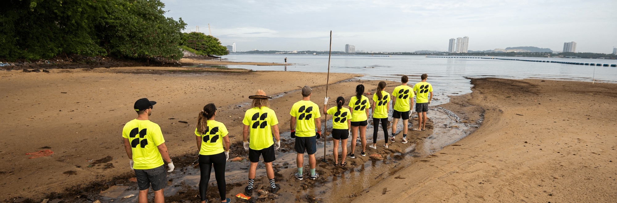
They work on the ground in the form of manned beach clean-ups. But they have also created a revolutionary high volume, low-cost River Plastic Recovery System, which collects plastics before they ever reach the ocean. To future proof our waters, they teach as they go, educating on marine protection and responsible plastic consumption, and empowering local communities to join the fight.
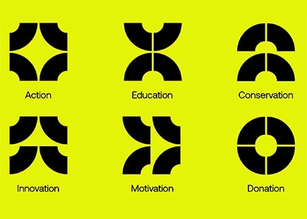
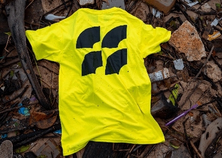
Seven Clean Seas, an ocean conservation business doing things no other business was, deserved a brand identity no other business had. The identity started with a single marque, inspired by ocean currents, and their role in distributing plastic waste globally.
The logo, formed on a basic grid structure, can be manipulated into different marques to create individual signifiers of the business, from conservation efforts, to educating new generations about the effects of plastic pollution.
Utilising the geometric workhorse that is Aeonik by CoType Foundry as the brand typeface, 20something were able to craft a brand that, whilst serious in topic, was able to flex between attitudes from corporate reports and presentations, down to social media posts, and even workwear gloves. The ambition was to ensure that the typeface felt both appropriate and inviting to all viewers, regardless of the content or message that was being portrayed.
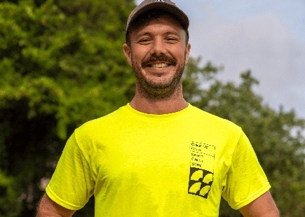
Seven Clean Seas’ work warranted a brighter colour. The chosen near-neon-yellow was inspired by both the alarming nature of hazard signs, and the reassurance of high-vis workwear – a nod to the very hands-on work that needed to be done. This creates a feeling of safety, but also alerts people to the work required if we are to significantly reduce the plastic pollution in our seas and oceans.

With transparency at the core of SCS, everything was designed to be as open and honest as possible. The site pulls in constant live data from Seven Clean Seas’ database, with everything from live feeds of total KGs of plastic removed, to in-depth insights about what is cleaned up on each individual beach clean.
With functionality in mind, Seven Clean Seas’ social media presence was also investigated. Much of SCS’ content is created on the go, whilst they’re on the beach, in the middle of clean-ups. The team can’t open Photoshop and start creating. There had to be a simpler, more immediate way to make worthwhile branded social assets.
20something built SCS a suite of interactive filters that subverted the idea of a traditional Instagram filter, and allowed SCS and their clean-up members to create branded graphics in the brands colour/font/style, with live data, allowing them to tag their location, and inform viewers of what they were up to in a matter of seconds.
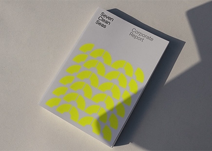
Everything was designed to be as actionable as possible, and help Seven Clean Seas do their critical work, knowing their brand was of an equal quality. Seven Clean Seas now boasts a new brand identity, website, crew uniform, volunteer t-shirts, functional apparel, river cleaner designs, and social media toolkit.
Tom Peacock-Nazil, founder of Seven Clean Seas, says “We’ve worked closely with 20something to develop a brand which truly represents us as a company. The team have created a bold, stand-out design that brings to life our hands-on approach to the ocean plastic crisis as well as setting us apart from our competitors. As a company, we’re at the beginning of our fight against ocean plastic and the launch of our new branding is the step-change we need to take our operations to the next level.”
Credits
Will Thacker: Creative Director
Fran Docx: Strategy Director
Rory Stiff: Designer
Casey Highfield-Smith: Designer
Nikki Hurren: Web Developer
Elliott Starr: Senior Copywriter
Hannah Jones-Walters: Business Director
If you enjoyed this article, you can subscribe for free to our weekly email alert and receive a regular curation of the best creative campaigns by creatives themselves.
Published on: