

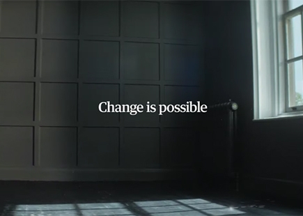
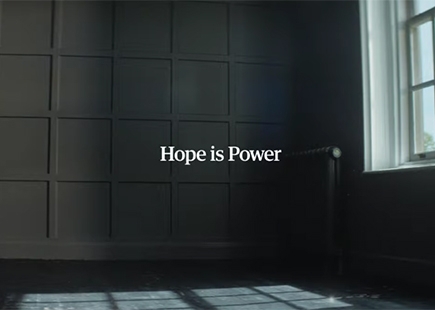
The Guardian uses a butterfly to powerful effect in its TV ad ‘Change is possible. Hope is power’
The Background
When many of us started out in marketing and advertising, seeing brand campaigns from newspapers was quite common.
They showed people what they stood for. Their position was clear. We could understand if they were for us.
But with ever-increasing pressure on circulation departments, selling the news was never enough and promotions, inserts and all other kind of non-news things have taken over the TV budgets (where they had one) of many of the biggest news titles in the UK.
But one is returning to the old ways.
The Big Idea
The Guardian has always tended to do things its own way and seldom follow the route of travel of other Fleet Street titles.
It was one of the first to see that its industry will go completely digital in time and has the best digital offering of any newspaper because it invested in it early.
It has also been very clear on what its politics are and what it stands for – and that has never changed.
So a new brand campaign called ‘Hope Is Power’ taps into the essence of what The Guardian represents, which has never been more relevant in these turbulent days of Brexit and seemingly extreme views.
The voice of challenge and change is something we all need right now.
What They Did
The campaign consists of a TV execution and a series of outdoor posters which all deliver the message that ‘Change is Possible’ and ‘Hope is Power’.
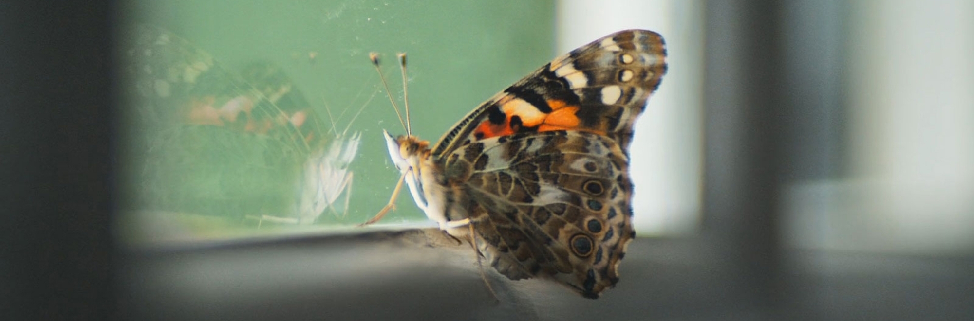
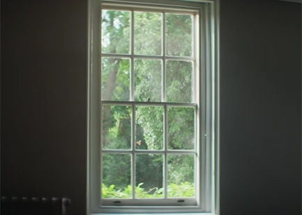
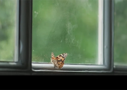
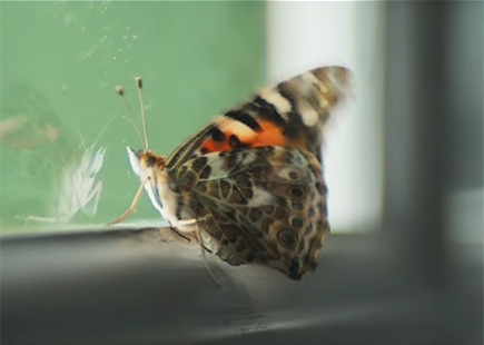
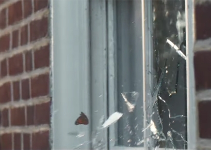
In the TV this is done by using a butterfly, which is the visual link in the campaign, trying to get out of a room to the world it sees through a window.
It is not able to get out after flying into it time after time, but never gives up and finally breaks the glass and is free.
For me, this reminds me of the great Guardian TV ad back in the day with the skinhead running down a road using the premise that you have to look at the complete picture to see things clearly.
The butterfly idea is simple, but impactful, and reinforces the idea of pushing back against things and never giving up.
It’s a positive message in these gloomy days and shines like a beacon.
The very same can be said of the outdoor with its bright, yellow design and fabulous typographic design reinstating what The Guardian stands for.
A classy creative feast in my opinion.
The Review
As mentioned, The Guardian has the best digital offering and has taken the decision, unlike others, to have no firewall and make its journalism available to all.
So yes, it is trying to encourage like-minded people to engage with it and make a donation to its cause which it is very open about asking for.
I like this open approach and it’s proved very successful so far.
I love this campaign for its simplicity and outstanding creative which was initiated by agency Uncommon London and executed internally at The Guardian.
In Hindsight
When I started writing this I was wondering if there were any similarities with the HSBC, We Are Not an Island campaign, which was viewed as an anti-Brexit campaign.
I don’t actually see that myself having worked on HSBC and I don’t see this as anti-Brexit either.
Yes, it is stating its position at a time when clarity is sorely missing from the great and the good, but for me, this is simply being open about what it has always stood for, similar to HSBC.
Its position has never been more relevant than it is today, and I wouldn’t change anything about this campaign.
I certainly would be proud to have my name alongside it.
If you enjoyed this article, you can subscribe for free to our weekly email alert and receive a regular curation of the best creative campaigns by creatives themselves.
Published on: