

Granville Island Brewing's redesign aims to reflect the people of the province
One of Canada’s first microbreweries, Granville Island Brewing, has launched a new brand identity to better reflect the role it plays, at the heart of British Columbia (BC), in the west coast city of Vancouver.
Re-establishing a sense of place, the new identity system seeks to reflect the lives of those who live in the province and help them to do more of what they love.
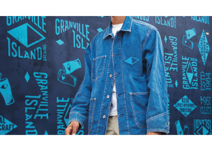
BrandOpus, the global branding agency behind the redesign, partnered with Six Pints Collective (owned by Molson Coors Brewing Company), owners of Granville Island Brewing, to craft a new strategy, identity and brand world. The new brand look and feel is launching now across packaging and venue.
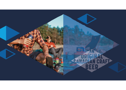
The people of the Canadian west coast define themselves not by what they do for work, but by what their passions are. They are do-ers, choose-lifers and are always seeking out the next experience. That’s why Granville Island Brewing set out to reflect this attitude, harnessing this spirit of doing more of what you love, at the heart of the new brand.
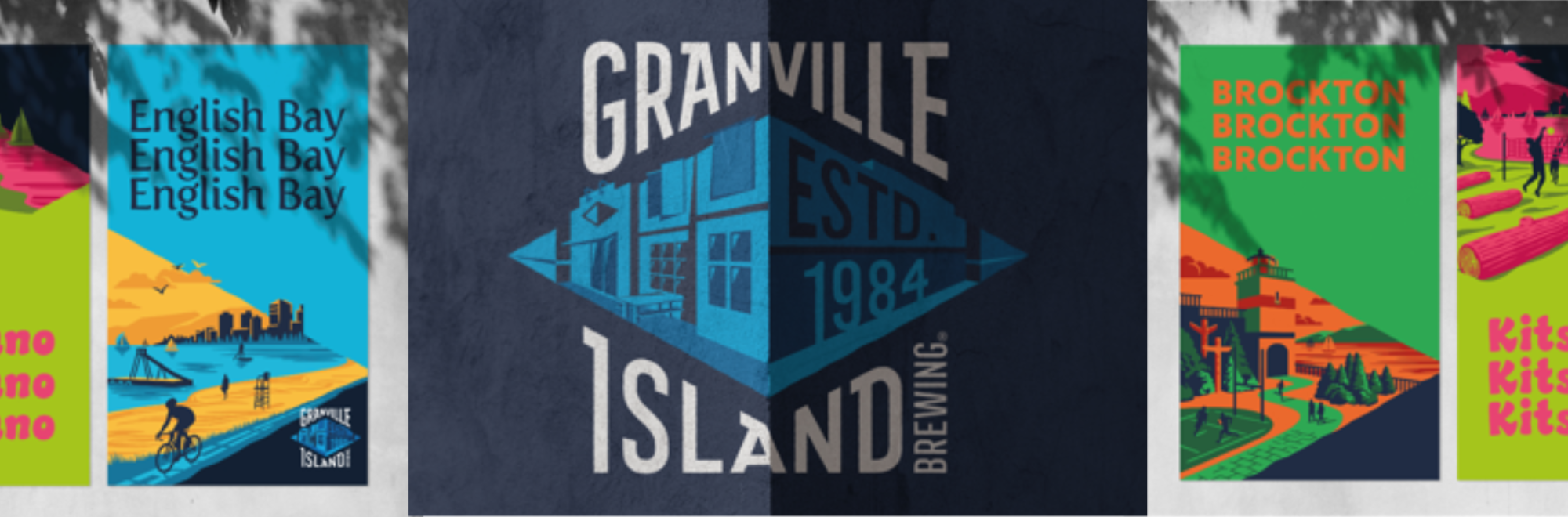
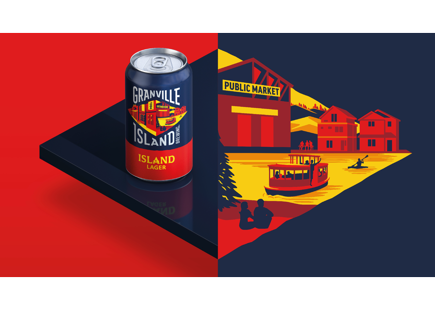
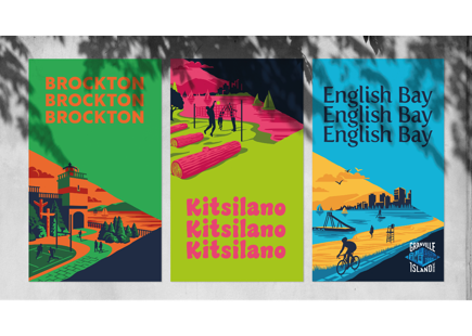
Antony Miller was commissioned by BrandOpus to create the graphic illustrative style, with the perspective drawing you in to engage with the different depictions and scenarios. A new vibrant colour palette was introduced to improve impact and navigation for consumers, helping them to find the brews they love.
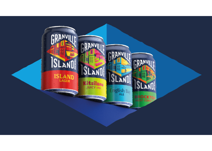
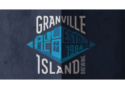
The wordmark has been evolved with more visual quirks. Hugging the diamond shape, taking inspiration from the corners of the brewery building and helping to frame the diamond symbol. Unique typography is utilized for each beer name, inspired by the location and style of the brew.
The redesign also marks the return of Island Lager, a 38-year-old favourite from the brand. As well as the launch of new brews, including Kitsilano Juicy IPA.
Iain Beauchamp, marketing director, Six Pints Collective, commented; “Granville Island Brewing has a history of bringing flavourful beers and new experiences to BC beer drinkers which is why we were excited to create a new look and feel which better reflects this. BrandOpus were a true partner in the journey to find what made us, us, and bring that to life across the full brand world. Now, I’m proud to say we have such vibrancy and character both on and off pack and can’t wait to see this fully roll out in the coming months.”
Maddie Freestone, senior designer, BrandOpus commented; “When you visit this famed island in Vancouver, you quickly learn how much it has to offer. So many adventures and experiences that embody the spirit and attitude of the local community. We were immediately inspired to bring this idea into the identity, re-imagining the existing diamond shape to give the brand a fresh perspective on what makes the place and the beers unique and compelling.”
If you enjoyed this article, you can subscribe for free to our weekly email alert and receive a regular curation of the best creative campaigns by creatives themselves.
Published on: