

Why a font illustrating the climate crisis is well intentioned but falls short
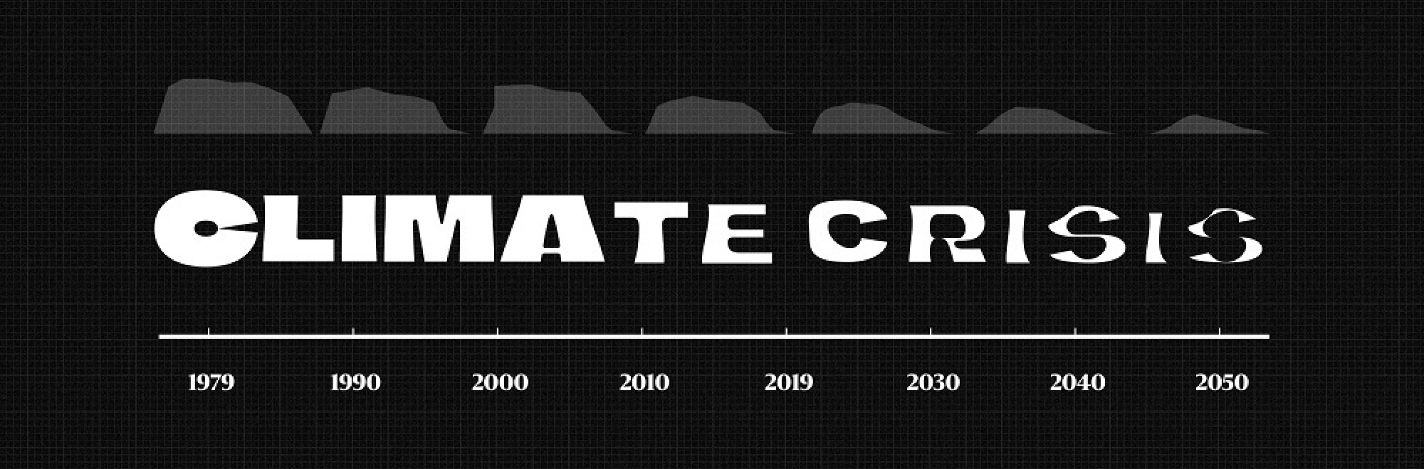
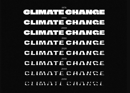
The Climate Crisis font is an Open Type font that’s been forged to highlight the disappearing Artic Sea Ice.
Any project that shines a light on the crisis we face is welcomed because time is indeed running out.
I’m sure the intentions of this project are well and good however, I feel that this campaign might be caught up in its own design echo chamber as it preaches to the converted.
The font has been created by the Nordic’s largest newspaper, Helsingin Sanomat, who say they are on a mission to make important and complex information understandable. The 8 font weights are based on artic sea data from 1979 and show the percentage change that has happened to date and will happen up to year 2050.
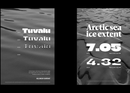
So it is a novel form of data visualisation and its picked up coverage across the advertising and design press. But it makes me wonder whether a geographical map showing the actual reduction in ice mass on a map would be more compelling than watching a font waste away, at least to the general public?
Despite good intentions, this feels like work that’s been crafted for the craft juries at award shows.
The Newspaper is quoted as saying “We hope that using the font helps people see the urgency of climate change in a more tangible form.” The Newspaper has an area on its site that shows their climate crisis coverage over the years set in the font matching the year of the article. This shows how attitudes have changed to the crisis but could they have gone further with practical advice.
The font could’ve been used in a guidebook aimed at helping us adopt the behaviours we need to embrace to limit the severity of the consequences that come with climate change.
The focus for this project seems to be on how quick the change in sea ice is changing without really helping people understand what they can do to help.
They could’ve have set one chapter solely in the 2050 weight to show the extreme path we’re on, if we don’t change the way our current operating system operates.
It’s interesting to see other newspapers such as Sweden’s top daily newspaper Dagens Nyheter has taken a stand against accepting adverts that promote petrol cars and long haul flying. This comes from the same title which had Greta Thunberg as a stand in editor for a day and is another example of them being a progressive supporter of sustainable living. I believe it’s a first for a publisher and that action will probably have way more influence on how people behave than The Climate Crisis Font.
I think with any creative work in this space we ultimately have to help people understand how they can help, how they can action behaviour change that will help us get to net zero and beyond.
A typeface isn’t going to help us reduce our carbon footprint.
We know through lockdown that when forced to we can make a sizeable dent in our emissions. The 7% reduction we saw in 2020 is what’s required year-on-year if we are to keep the temperature increase to 1.5 degrees. That is a massive ask.
Last year with the Great Reset via The Purpose Disruptors we saw agencies and individuals come together to create campaigns that encouraged the continuation of the positive behaviours we’ve learnt during lockdown.
If you enjoyed this article, you can subscribe for free to our weekly email alert and receive a regular curation of the best creative campaigns by creatives themselves.
Published on: