


Coca-Cola and a pet shop deploy attention-grabbing hacks
Making people stop and look is a universal creative goal, so we investigated how vintage Coca-Cola print work and modern-day pet shop posters provided very different shortcuts to attract gazes.
Great advertising often succeeds by making audiences lean closer and work a little for the creative reward. Two campaigns demonstrate this quite nicely, we reckon.
Coca-Cola, always on point with its subliminal and sensory advertising, dropped a minimalist typography-driven work for 'Taste the Feeling' back in 2018.
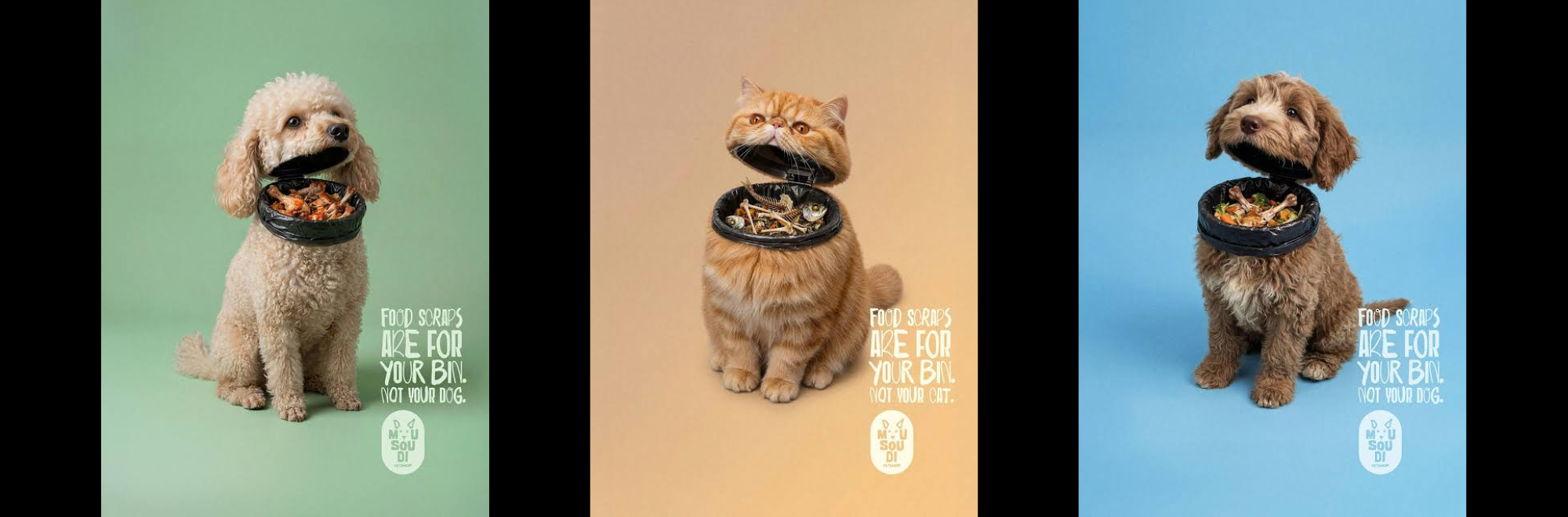
Meanwhile, Ogilvy Greece's surreal 'Food Scraps' campaign for Mousoudi Pet Shop also grabbed some organic attention.
Coca-Cola’s ‘one simple trick…’ relies on using tiny typography to make the audience stop and lean in.
Deliberately withholding information forces passers-by to move closer to glean what they might’ve missed. In outdoor advertising, where bigger usually equals better, the decision feels subtly rebellious.
The Mousoudi campaign achieves the same effect, but through surrealism.
By visually merging pets with discarded food, the posters initially confuse. Is that a dog? Is that leftovers? The viewer pauses to work it out.
The message reveals itself on reflection, namely that loving pets means resisting the temptation to feed them unhealthy scraps. A similarly surreal effort was seen last week, by Twix, in fact.
Subverting attentions
There’s a deeper point somewhere in all this: effectiveness is often mistaken for visibility, when what you’re really after is attention. Luckily, there’s a long tradition of print advertising that uses visual tricks to earn attention.
Logo design can be tuned to cause the viewer to pause and reflect. The FedEx logo, for example, has an arrow hidden in the negative space between the "E" and "x". This might sound asinine, but the subconscious dopamine ‘reward’ that it triggers is the difference between memorable and forgettable.
Having a catchy ‘house style’ in your ads is also important to trigger familiarity and trust.
The Economist's iconic red posters, National Geographic’s classy green framing devices and Gap’s blank white backdrops are all serving a similar end.
Another trick is using a single line or visual contradiction that only makes sense after a moment's thought. Volkswagen's classic ‘Think Small’ campaigns broke advertising conventions by surrounding a tiny car with vast amounts of empty space, forcing audiences to notice what should have blended into the background.
Coca-Cola’s deliberate understatement and Mousoudi’s surreal visuals remind us that creative advertising often involves a little mystery.
But we welcome any creative’s feedback on any tricks we’ve no doubt missed: tom@creativemoment.co
If you enjoyed this article, you can subscribe for free to our weekly email alert and receive a regular curation of the best creative campaigns by creatives themselves.
Published on: