

Why Coca-Cola has been relentlessly disrupting its visual branding
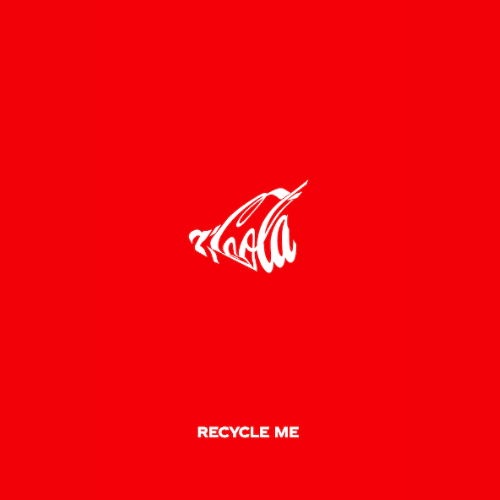
Coca-Cola’s recent campaign features a ‘crushed’ version of its logo, designed to make viewers associate the product with recycling.
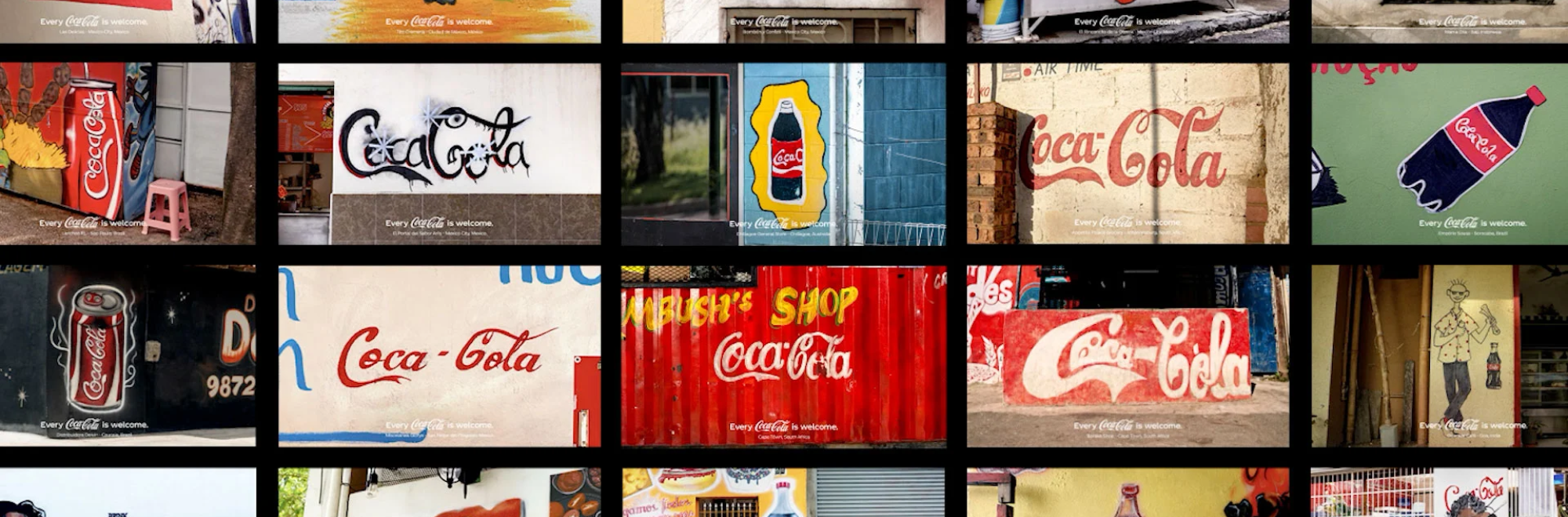
A recent Coca-Cola campaign, developed by WPP Open X, led by VML and supported by Essence Mediacom and Ogilvy PR, triumphantly exclaims ‘Every Coca-Cola is Welcome’ in order to showcase the various creative local interpretations of the Coca-Cola logo in a range of off-kilter, but affectionately portrayed home spun designs.
But is this part of a new direction for the brand?
The campaign ran in Brazil, Mexico, Indonesia, Australia, and the United States, including in the marquee placement in New York's Times Square as well as across the brand's Instagram profile image, and its YouTube channel: which ran films and interviews with store owners.
Now, Coca-Cola is at it again, subverting its instantly recognisable logo into something less distinctive, but still very much recognisable, through a campaign designed to encourage recycling of its products.
From WPP Open X and Ogilvy New York, Coca-Cola's Recycle Me campaign depicts skewed and distorted logo designs that represent the forms of cans that have been crushed by consumers before being sent for recycling. Ogilvy says the creative team used mechanical presses and vacuums to physically crush cans and capture the real distortions to the historic Coca-Cola script logo design that resulted.
Our take
The Coca-Cola logo has been plastered across store front, billboards, sports stadiums and movie sets since, well, 1905 when tasteful joined-up lettering reached its final form.
Part of the point of this relentless repetitiveness is to make the consumer subconsciously accept the brand as part of the everyday life. It’s interesting then, to see Coke drawing extra attention to its brand hallmark.
Does this signal the completion of its brand dominance?
The ‘Share a Coke’ campaign of 2013-14 was an early example of the logo being disrupted – in this case with names of people to add a sense of personalisation and individuality to the previously homogenised positioning. In 2021, the ’Open to Better’ campaign built on this theme by adding messages of hope and optimism.
The recent campaigns arguably see the logo at its most distorted yet, but the general idea is to associate the brand with positive scenarios – in this case recycling, and individual stories of Coca-Cola brand loyalty.
‘Why now?’ is a tricker question altogether. Perhaps in the age of Big Data, it’s not enough to treat everyone as a mass consumer when it’s increasingly achievable to ask ‘what does a brand mean to you?’
If you enjoyed this article, you can subscribe for free to our weekly email alert and receive a regular curation of the best creative campaigns by creatives themselves.
Published on: