


Football kit design is a whole new ball game
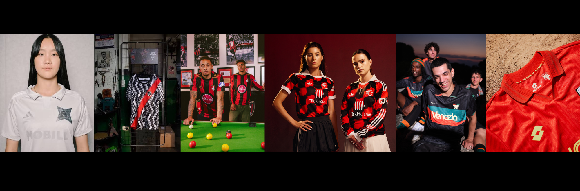
A great football kit is truly unforgettable, says Launch's head of creative Kevan Barber, but how do this year’s efforts stack up?
The beautiful game has always had key parts that combine to deliver the world’s greatest sport: players, fans, stadiums, goals, and iconic kits.
And kits are evocative. You remember your club’s best forever; 95/96 being my club’s best year, and the year I began supporting Newcastle United.
Each preseason, fans wait with bated breath to see whether the manufacturers have delivered the goods for the forthcoming season or delivered a stinker.
There’s no doubt kit designs and launches are in the midst of a golden era with manufacturers like adidas and Nike leading the way, but brands considered more retro, or the connoisseur’s choice, are also grabbing attention.
There are a few design choices that create the fabric of a winning kit: colour and pattern, the use of club identity, the manufacturer’s logo, and, a little harder to control, the sponsor(s).
But who’s got it right for the 26/27 season? The quality’s so high at the moment, so this is just a handful of those that got the full package right for various reasons.
Venezia
Venezia set the standard back in 2022 with a full-on fashion shoot to launch that season’s kits. And any article on football kits and creativity has to have a mention of this Italian trendsetter of a club.
Venezia’s still smashing it out of the park when it comes to kit designs. The simple designs, clean club crest, great sponsor logo and marketing all make every kit from the club tick.
The photography is as iconic as the city it’s shot in - even the teaser photos for the new away kit that have appeared at the time of writing just do more than typical sports marketing did before Venezia came along.
AFC Wimbledon
As mentioned, it’s sometimes the kit manufacturer itself that really makes a kit, especially when we’re talking about the Kappas and Le Coq Sportif’s of the footballing world.
AFC Wimbledon has another of these icons of retro kit design, Lotto, or ‘Lotto Sport Italia’ as the club refer to it. Its red 26/27 away kit is a tribute to its promotion to the top flight in 1986, and even features the yellow star worn by the speedway team from Wimbledon, which used to compete on the same site as the Dons’ stadium today.
The slight shine to the kit’s material (common amongst the best retro-inspired kits this season) finished it off nicely and shows the lower leagues don’t have to mean lower quality threads.
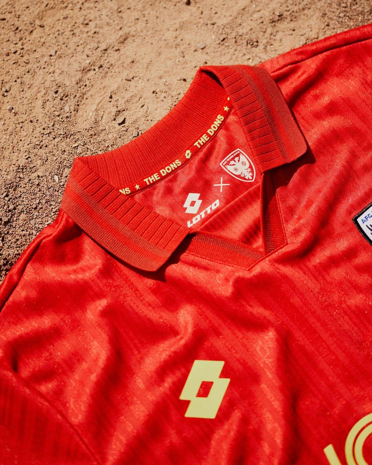 Credit: Football Shirt Culture
Fulham FC
This one seems to be divisive. Fulham’s away shirt this season is another reimagining of a former kit; this time it’s a combo of mid-90s pattern and 70s crest.
This has all the hallmarks of a good adidas kit; the trefoil, the retro club crest usage, the collar, and unique pattern. When adidas does it well at the moment, it’s the best of the big three manufacturers.
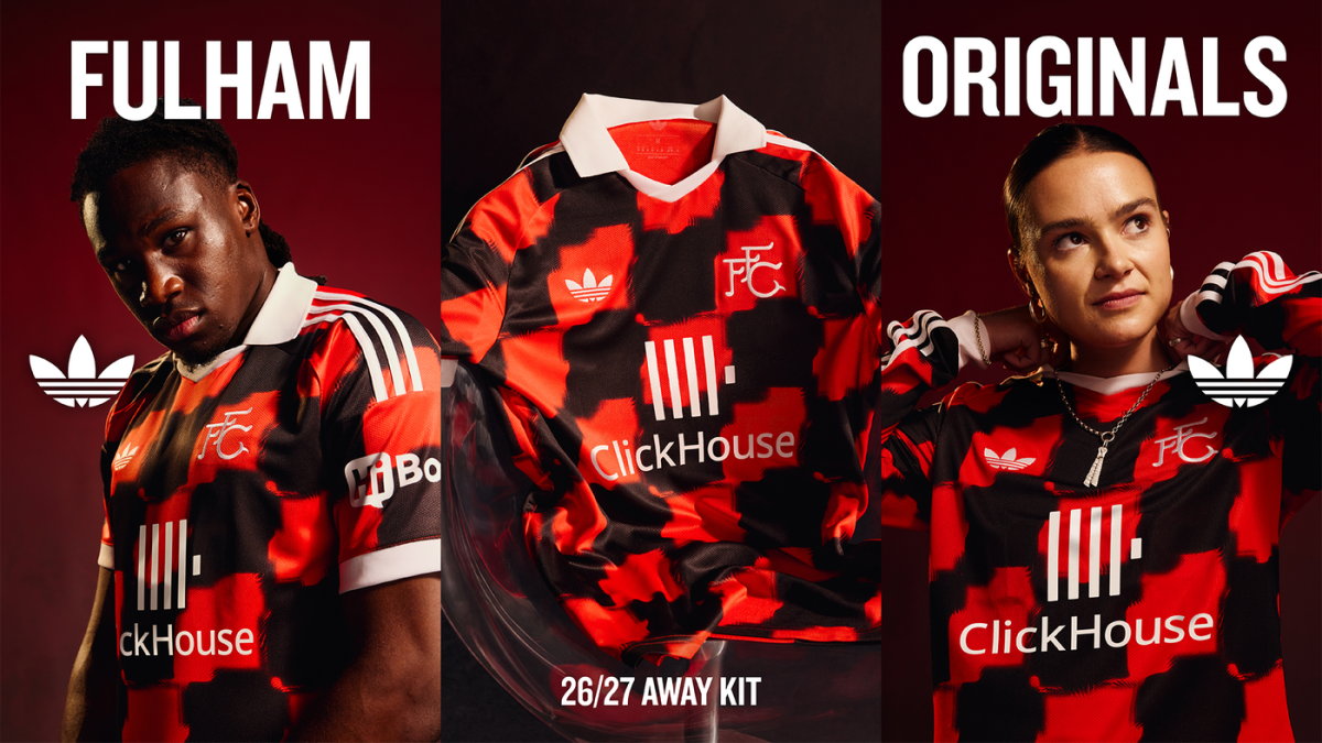 Credit: Fulham FC
Manchester City
This feels like City’s way of saying they’re the real club in Manchester, although it’s getting increasingly hard for them not to be considered another tourist club. The icon of Manchester, the bee, is woven into the design.
Last season’s Manchester-inspired creation for the club was one of the weirdest kits around, mimicking raindrops on a window; safe to say this one feels like a more fitting design for a football shirt.
And, at a time when Manchester’s getting more attention than ever, reaffirming the club’s position as Manchester’s ‘real’ club is a shrewd move (despite the reality of the tourist fans they now attract).
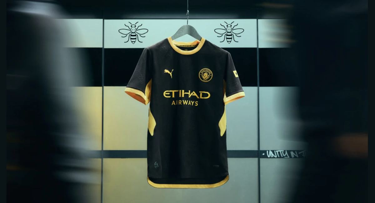 Credit: Manchester City
RC Strasbourg
Another strong contender for the very best shirt of 26/27 from RC Strasbourg, part of its 120th anniversary celebrations. White with the 90s-inspired diamond pattern and adidas trefoil, it feels retro, it feels French, and it’s got a sponsor to fit the vibe—Winamax.
The only thing to let it down turns out to be the sponsor, which is actually an online sports betting site, something now banned from the front of Premier League shirts, leading to new questionable sponsors like Aston Villa and Visit Rwanda.
Club Deportivo Municipal
A campaign for a shirt from the Peruvian outfit that has seen them release a shirt featuring 1,000 sponsors, saving the club from the threat of bankruptcy.
Perhaps not one for those in the business of buying shirts for fashion, but hats off for the idea.
Djugardens IF
Like the previous example, this one is as much a campaign as a kit.
To celebrate its 135th anniversary, the Swedish club released a steel-coloured special edition kit that both celebrates the club’s past and sets fans up for the future.
The catch? The future is 135 years from now. The kit acts as a season ticket for the 2161 season, turning the kit into an heirloom worth keeping in the family.
Honourable mentions to AS Roma, getting the same treatment as Fulham and RC Strasbourg in terms of a stellar classic Adidas kit, and FC Barcelona, who, like PSG have shown that there’s a return to more colour in kits over understated and almost luxury colour choices.
AFC Bournemouth
And I couldn’t write a piece on this season’s kits without a special mention for Bournemouth’s sponsor, Vitality. Sponsors have to win the appreciation of fans; show their understanding of the club they claim to now care about.
Vitality has fallen at the first hurdle with its rigidity towards how its logo is seen on Bournemouth’s kits. A giant pink circle makes the home kit, in the words of fans online, “unbuyable”, “Championship-level” and “ruined”. But what can you expect from a sponsor that was also happy to slap its name on a stadium - another sponsor move that tends to be misguided, just ask Mike Ashley.
You can only imagine how disappointed Hummel’s designers were when they were told the giant pink circle had to stay on the RED, black and gold kit they’d designed.
With the launch of the third kit, also ruined by a giant pink circle, one fan summed it up best: “Get rid of the pink blob. Or just keep your head buried in the sand and ignore the fans @vitality_uk”. It’s more than a design choice; it’s a comms issue for sponsors that ignore the fans they’re trying to buy the favour of.
If you enjoyed this article, you can subscribe for free to our weekly email alert and receive a regular curation of the best creative campaigns by creatives themselves.
Published on: