

It takes TIME.

By far, the most popular post I have ever put on LinkedIn was when I shared the most recent cover of TIME.
At the time of writing, over 100,000 people have viewed it (and it's still rising).
And over 3,000 people have reacted to it.
Most loved it. It also raised some debate.
It was designed by TIME creative director D.W. Pine and due to the unbelievable response to this post, I thought I would take a closer look at his work.
He has, since 1998, created over 700 covers for TIME; the US weekly news magazine and website published and based in NYC.
700.
Many of them pretty exceptional. And memorable.
First published in 1923 in the US, TIME then branched out to include a European edition published in London. It also covers the Middle East and Africa and now Latin America too. It's basically all over the world with the print edition claiming a readership of a whopping 26 million, 20 million of whom are American.
The covers D.W. has designed I think are brilliant.
It's not only the concept behind the covers, or the blinding artwork but to get the tone and message right, within a complicated political landscape, is such a unique skill.
They capture the moments they are interpreting so well, with beautiful illustrations and where appropriate, humour. They say so much in a single image.
His covers include sublime artwork, illustration, animation, and photography. He plays with the historic TIME logo, sometimes immersing it within the picture.
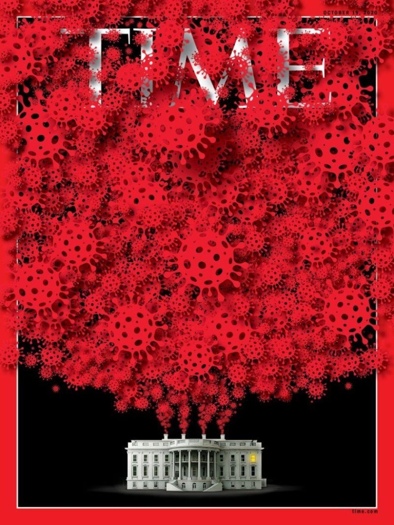
This cover takes the scientific graphic we now associate with coronavirus and entwines it with the TIME logo like an elaborate floral display. It is, of course, visually representing the way the virus took hold of the Whitehouse.
The brand, of course, is strong enough to take it.
Not all could.
If you enjoyed this article, you can subscribe for free to our weekly email alert and receive a regular curation of the best creative campaigns by creatives themselves.
Published on: