

Meet The Maker: Leo Burnett's creative team talk about how they delivered these stylish print ads for McDonald's
Creative Moment speaks to the makers of the simple and stylish McDonald's print ads for McDonald's Delivers.
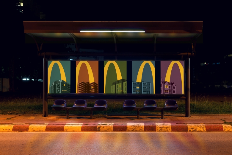
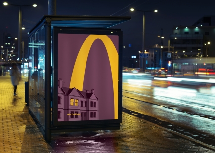
Leo Burnett created a series of subtle and effective ads to promote McDonald's delivery service, bringing one of the nation's favourite foods into homes during the lockdown.
Creative Moment editor Lucy Smith spoke to the creative team for a behind the scenes look at where this work began, the ideas that didn't make it and how it all came together.
Thanks to creative directors Andrew Long and James Millers and senior designer Sam Kallen for sharing the intricacies and processes behind this work.
Lucy Smith: What was your brief and where did you begin?
Andrew Long/James Millers (creative directors): There wasn’t so much an actual brief, more so a moment in time that felt culturally relevant to respond to. People were being encouraged to stay home due to the ongoing pandemic, and we felt we could support that message by promoting the fact that McDonald’s deliver.
So, it was a bit more of a proactive response really, but the brief we set to ourselves was how can we simply remind people that they can still get the great McDonald’s food they love, straight to their house.
LS: What was the insight/research behind this creative?
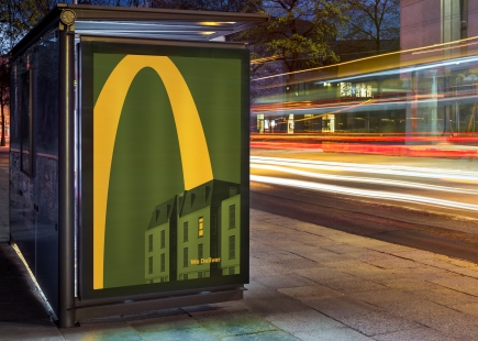
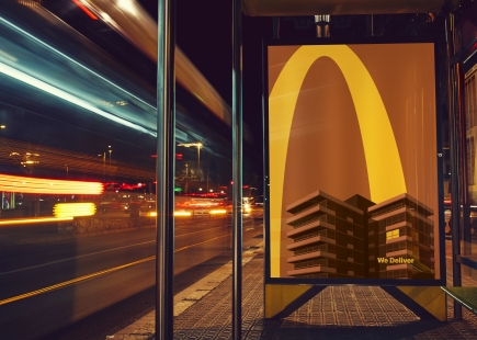
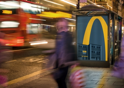
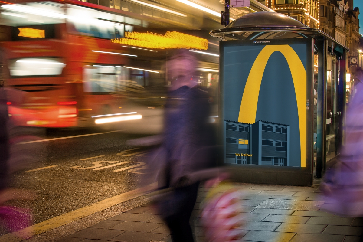
AL/JM: For millions around the country, the golden arches of McDonald’s is a beacon of optimism. We wanted to use that iconicity to show customers that so long as their light was on at home, the McDonald’s lights would be on too, to deliver those little lifts that are needed more than ever.
LS: How did you come up with the final idea?
AL/JM: We’re lucky really that we have such a fantastically iconic brand with incredibly iconic branding. So, it was a case of, how do we link the iconic lights and signage of McDonald’s to the lights of people’s homes.
After we arrived at that, the concept of using the arches as a symbol of the delivery journey was a no brainer. We then looked at different ways of doing it. We looked at photography initially, but we thought that with a big bold graphic shape like the golden arches, creating something illustrated was the right way to go to make it feel completely integrated.
LS: What does the creative process look like for the team that worked on this?
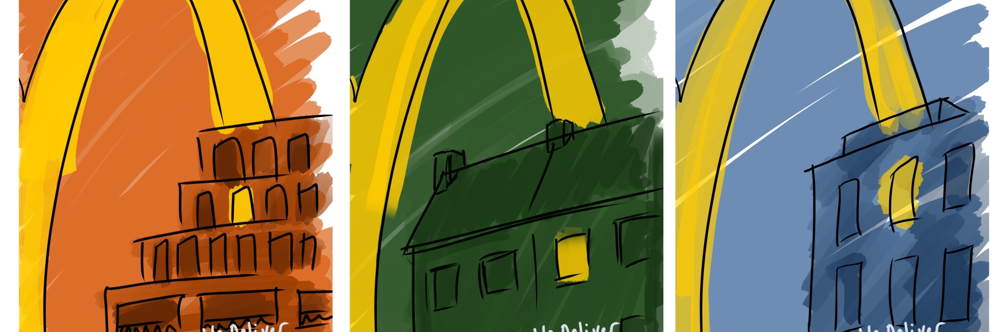
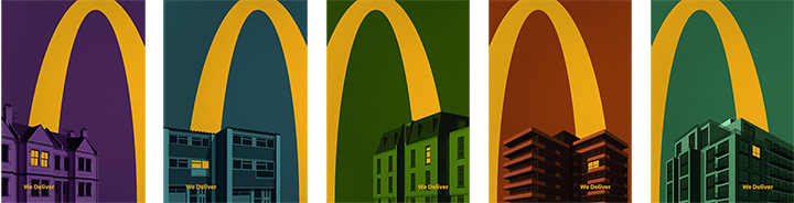
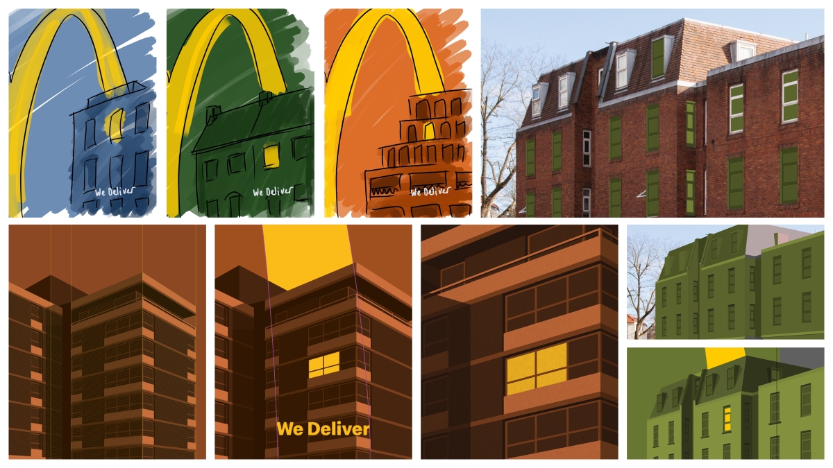
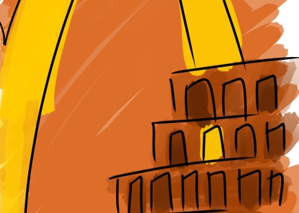
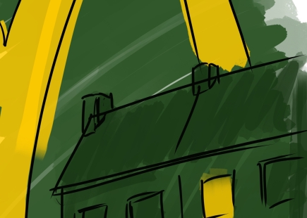
Sam Kallen (senior designer): After the initial concepts were approved, the first step was to identify five examples of the most familiar forms of UK housing: modern flats, terraced houses, the tower block, classic three-storey sixties and eighties apartments. To get to the final five, we photographed and sourced images of hundreds of buildings - mocking them up under the golden arches with a colour treatment to get an idea of how they would look. This was also useful in working out our colour palette and which five buildings worked best together as part of the wider set.
Each building was drawn in vector format using a grid system that ensured consistently straight, vertical lines and realistic perspective. Windows, railings and balconies were drawn individually to capture the unique angles of each – a very time-consuming but worthwhile process! Following the direction of the golden arches, lighting on the building and shadows were added in and carefully crafted. Following this process for each building meant we had five really detailed, unique illustrations that still felt consistent.
We had daily team reviews throughout the process to keep improving the work. New ideas and little details were often added off the back of these discussions – for example, the TV aerial on the terraced house.

LS: How did you work through the art direction on this: what did you try, what didn't work?
SK: For each building we used a ‘night-time’ monotone colour palette, with variations and tints to create detail and depth.
We did also look at introducing a secondary colour for a duotone approach, but we felt using just one colour for the buildings was bolder, simpler and brought the idea to life in the best way by contrasting with the single golden arch and illuminated window.
LS: Assuming you all worked on this remotely in your own homes due to lockdown, how did this way of working affect the team, if at all?
SK: We have all been used to working remotely for the best part of a year due to lockdown. Working through the design process on a project like Lights On is always easier in person as you can sit down together, create mark-ups on work and experiment or try things out on the spot.
However, through regular check-ins, open creative discussions and screen-sharing we were able to deliver a really successful piece of work that the whole team is proud of.
Credits
AGENCY: Leo Burnett
CCO: Chaka Sobhani
EXECUTIVE CREATIVE DIRECTOR: Mark Elwood
CREATIVE DIRECTORS: Andrew Long, James Millers
COPYWRITER: Andrew Long
ART DIRECTORS: James Millers, Will Rees
ILLUSTRATOR + DESIGNER: Sam Kallen
If you enjoyed this article, you can subscribe for free to our weekly email alert and receive a regular curation of the best creative campaigns by creatives themselves.
Published on: