New year, new logo: what designs from Nokia, Honda and Deezer say about 2024

Ever since Covid-19, we’ve been cautious about ushering a new year in with overly optimistic sentiments.
Re-invention, however, can be critical for commercial survival, and tweaking your logo is among the boldest creative moves.
Creative Moment gives its lowdown on three of the new logos defining 2024:
Nokia’s ‘digital-first’ new look
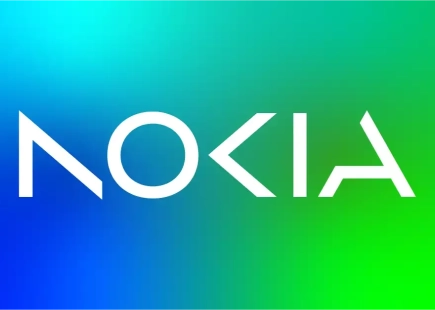
Looking at the (now old) Nokia logo is a bittersweet experience. Nostalgia, respect, but ultimately sadness prevails, as you nod honourably to the mobile brand that started it all (sort of), before seeing its market share eaten away like a bite from, well…an Apple.
Nokia – once in the pockets of more than a billion people – has remained on consumer radars, but part of us pines for a return to relevance. Enter, designers Lippincott, that was tasked with a full-scale transformation, fusing the brand’s rich heritage with a bold, digital-first identity.
The goal was to unlock the brand’s next stage of growth while demanding recognition of Nokia as a leader in B2B technology innovation. Lippincott worked to articulate the company's ambition, positioning it as a ‘pioneer in the convergence of networks and cloud technology’.
The rethink is part of a ‘new brand purpose’ for Nokia, as its press release states: "At Nokia, we create technology that helps the world act together". This purpose is embodied in a refreshed logo and visual identity designed to signify change and encourage stakeholders to view Nokia through a different lens.
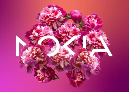
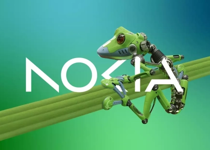
The identity retains the iconic elements of the original logo while infusing it with a contemporary, dynamic aesthetic. The logo's geometry was simplified, with individual letters of the logo abstracted to visually represent Nokia's ‘collaborative ethos’.
Our take
The logo does what it was designed to do—make us rethink the brand’s position in a future-facing direction, rather than as an anachronistic, if lovable, also ran.
The imagery alongside it, meanwhile, is upbeat, plays to our AI future, and gives a fun sense of exploration and openness.
Project: Driving recognition for Nokia as a B2B tech powerhouse
Designers: Lippincott
Design Team: Lee Coomber, Louise Cantrill, Vimmi Sveinsson, Carl Baldwin, Timothy Stewart, Ariel Chan, Kannie Lam, Josh Grazier
 Credit: Nokia
Honda subtlety warps our perceptions
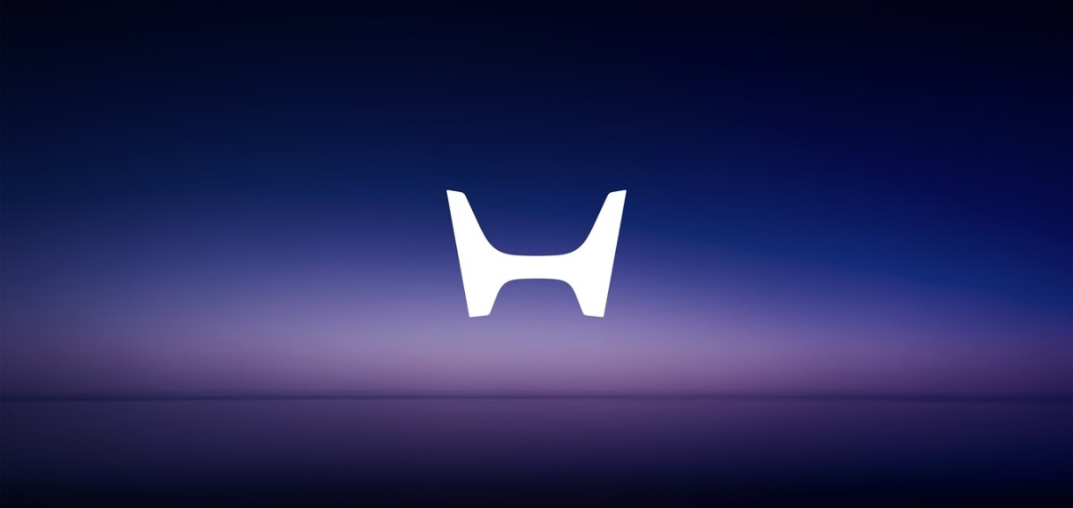
Honda has unveiled a revamped version of its iconic ‘H mark’ logo, for the first time since 1981.
The updated emblem, intended for forthcoming electric vehicles (EVs), including the Series Zero models, was showcased alongside the debut of the new EV line at CES. The redesigned logo features a simplified shape and a more contemporary aesthetic, intended to embody Honda's dedication to EVs.
Scheduled to premiere on "next-generation EVs," including the 2026 production versions of the Series Zero vehicles, the logo marks a departure from the familiar ‘squircle-shaped’ H, adopting a sleeker, wider, and more sharply angled design resembling two outstretched hands.
Although it remains uncertain if non-EV Honda models will adopt the new emblem, Honda has outlined ambitious plans for EVs and fuel-cell vehicles, aiming for them to constitute 40 percent of new-vehicle sales by 2030, 80 percent by 2035, and achieve full electrification by 2040.
Our take
It seems as good a time as any to reinvent your automotive brand, and with Tesla currently boasting a larger market cap than all other vehicle manufacturers combined, positioning your logo to be electric car friendly seems like the way to go.
Our first look at the logo took a while to get used to. However, seeing it in context on one of its cars made it clear that a more paired down, minimalist look is fitting for the futuristic, sleek lifestyle stylings of Honda’s upcoming range.
 Credit: Honda
Deezer embraces sound aesthetics
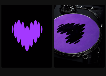
Koto, renowned for its design expertise with clients like Amazon Music, AMP, Netflix, Sonos, and Spotify, has undertaken a significant revamp of the identity of the music streaming service, Deezer. Launched in 2007 and boasting a substantial user base of ten million paid subscribers across 180 countries, Deezer approached Koto with a desire for "substantial change" and a re-evaluation of its core purpose.
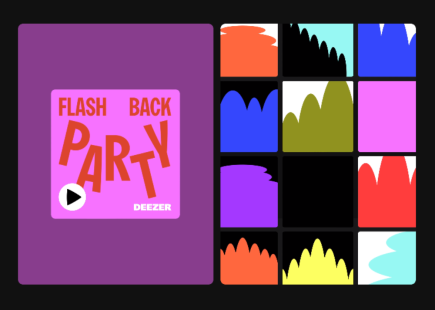
Joe Ling, creative director at Koto, highlighted the challenges involved, the first being aligning the brand with the strategic focus of Deezer helps you be and belong. Secondly, there was a need to establish a cohesive visual narrative across the entire identity and user experience. Lastly, Koto aimed to carve out a unique identity for Deezer in the market, accentuated by the introduction of a distinctive colour, known as Deezer Purple. Ling envisions this hue becoming synonymous with Deezer, akin to Netflix's association with red and Spotify's with green.
Our take
In hindsight, Deezer’s old logo – while bold and memorable – had the same feel as the web ‘2.0’ logos of old. This rethink is welcome. The ‘Deezer Sans’ font, accompanied by the heart logo and vivid purple gives a cartoony, ‘Nickelodeon’ vibe. The accompanying graphics are targeted unashamedly at the younger demographic, a smart move considering Apple and Spotify’s more age-neutral looks.
The design has another benefit: it doesn’t contrast too much with the plethora of musical acts that populate its service, allowing it to sit comfortably beside its catalogue of tunes when browsing the site.
 Credit: Koto Studio
If you enjoyed this article, you can subscribe for free to our weekly email alert and receive a regular curation of the best creative campaigns by creatives themselves.
Published on:


