

Admiring the artistry of Gucci’s new Bloom perfume campaign
Conceptualised by the luxury brand's creative director, Sabato de Sarno, Gucci’s Bloom campaign focuses on the theme of ‘self-discovery’.
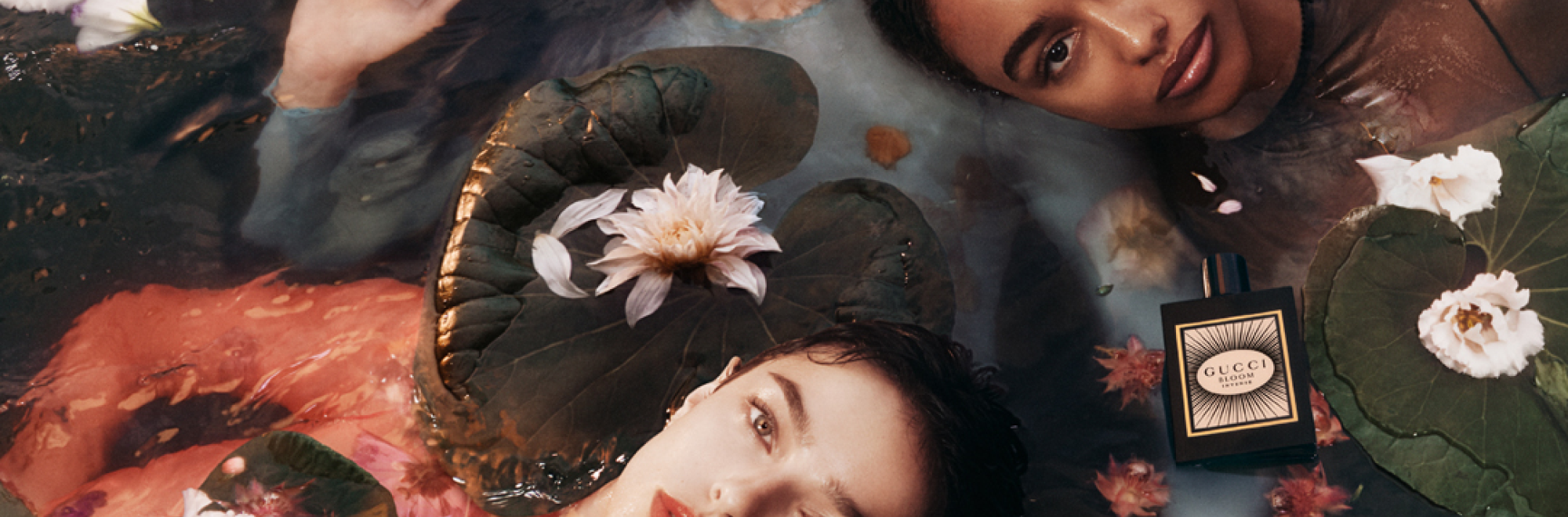
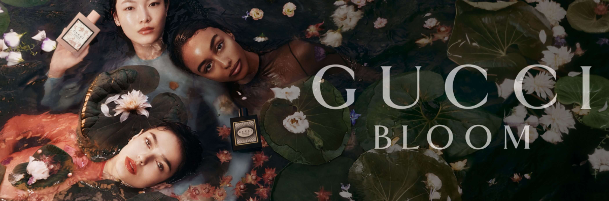
De Sarno draws inspiration from the imagery of a dreamy floating garden and the strength and grace of women embarking on a voyage of self-exploration and empowerment. A spokesperson from Gucci said: "Gucci Bloom celebrates the journey of authenticity and self-realisation as women blossom into their genuine selves within their female circles. Trios resonate throughout the campaign imagery and product visuals: three women, three fragrances, three white florals. Each depiction invites embracing freedom and vitality."
The journey of Gucci Bloom began with its original Eau de Parfum and has since broadened to encompass Gucci Bloom Eau de Toilette and Gucci Bloom Eau de Parfum Intense. Concocted by master perfumer Alberto Morillas, the initial fragrance features notes of tuberose and jasmine, accompanied by a Rangoon Creeper undertone.
Each fragrance is housed in a striking square bottle, showcasing hues from soft powder pink to bold black, mirroring their distinct personalities.
Our take
As avid scrollers of all things creative, fashion brand campaigns – while always well shot, artfully directed and tasteful – rarely feel worthy of commentary. This is largely because creatives are rightly keen to let the clothes do the talking.
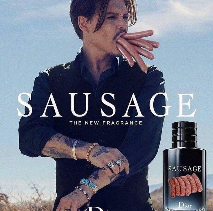
Perfume adverts, meanwhile, often titter close to the sort of parody shown in Michael Cera’s Cera Ve ad, which debuted at the Super Bowl. Johnny Depp’s SAUVAGE advert, for example, was practically asking to be satirised with the word ‘SAUSAGE’, in hindsight.
This Gucci campaign, however, really stands out. Firstly the bottles are designed in a way we’re tempted to label ‘iconic’. It takes real curation skills to opt for such a simple, yet elegant shape, like a Deco take on the Eternity by Calvin Klein bottles, yet somehow thoroughly modern.
And, those visuals are nothing short of stunning. The Monet inspiration is worn on its sleeve, but there’s also a darker nod to the Death of Ophelia (1851-1852) by English Pre-Raphaelite artist Sir John Everett Millais.
The art direction, the clothes, the eerily murky water, the otherworldly, seductive expressions on the models’ faces. It’s a bit of a masterclass, frankly.
If you enjoyed this article, you can subscribe for free to our weekly email alert and receive a regular curation of the best creative campaigns by creatives themselves.
Published on: