

Election Watch: Conservatives, Labour and Lib Dems proudly present quantity over quality
February has been and gone and we’re already well into March’s round of political warfare.
And to be honest, it’s grim out there.
Every party is busy testing every message and angle of attack under the sun, which means there’s a whole lot of quantity and not all that much quality right now.
It’s also my solemn and reluctant duty to tell you the Labour Party have rediscovered memes. I’m sorry.
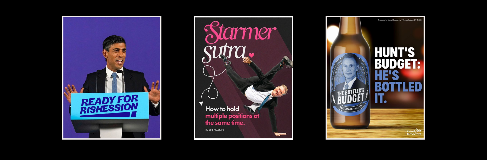
Labour - Ready for Rishession
Labour have nailed rule one of political advertising - it knows the enemy. It’s Rishi Sunak.
That’s the easy bit. It spent February trying to figure out the harder bit - creating content people will remember.
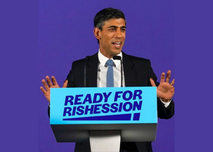
And there was a lot of it - all around the idea of making Sunak own the recession. As you’ll see from the image above, it’s very much still a work in progress. The phrase Rishi’s Recession has a ring to it, it’s simple, memorable and has a nice bit of assonance tying it all together. 'Ready for Rishession' takes that simplicity and throws it out the window for the sake of a pun. It’s less good.
Oh and let’s not forget them ripping off M&S. It’s better as it doesn’t have an awful pun. But it’s also entirely forgettable.
If this was a creative response to a client, the ad agency would be politely asked to have another go at the execution - and I think someone needs to tell Labour’s attack team to do the same. It’s an election year - they need to be better than this.
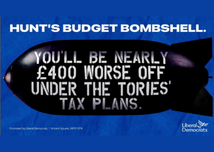
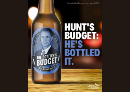
Liberal Democrats - Budget Blues
This is a classic of the political advertising genre.
It makes clear who the enemy is, tells voters why it’s a problem for them and has an easy to understand visual.
All good stuff.
It’s also nothing new.
For anyone old enough or geeky enough to remember the 92 election, they’ll remember a famous Conservative ad. Same layout, same messaging, different colour and target.
Some might call it thievery. Some might call it a smart call back. Most won’t care.
Whatever you think - it’s an effective, topical ad and one I’d expect to see more of over the next few weeks.
And our favourite political graphic designers didn’t stop there. They created a fake beer too.
I take one thing away from this - the Lib Dems have decided the enemy for its potential voters isn’t Sunak. It’s Jeremy Hunt. Which is a massive clue about its election plans. It's not fighting a national battle - it is fighting a targeted regional one across the home counties. And who is a better enemy there? Our dear chancellor. Clever clever stuff.
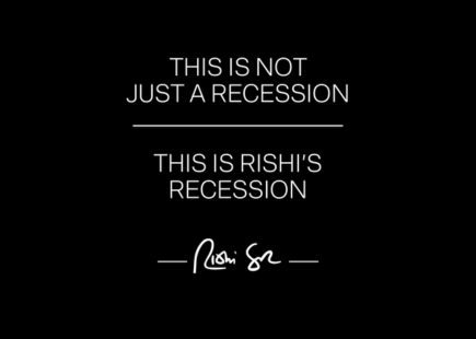
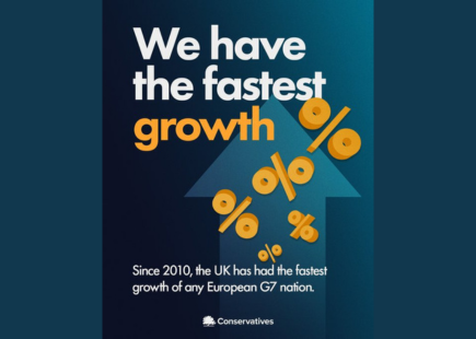
Conservative party - Starmer Sutra
A comment on last month’s column asked what some examples of positive political advertising looked like - the majority of political ads are negative, so what happens when we flip the script. Well this month’s budget has delivered some rare examples, though I can’t say they’re very good…
What is this designer thinking? Assuming this claim is true, it’s a brilliant story to tell - and could help contextualise the country’s problems - even if it reads like they forgot to finish the headline.
But the design looks like something a 90s high schooler experimenting with Microsoft Word Art put together.
This speaks to one of the biggest problems in political comms - the discipline is dominated by people who love words. The art is an afterthought.
And that means we get posters like this - ones where I can find nothing good to say about the visual or the person who signed it off.
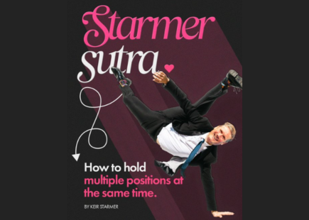
Let’s finish with the inevitable personal attack on Starmer. In this month’s vague attempt at a cultural reference, we have a Valentine’s themed image - the Starmer Sutra.
Again the graphic design is, well it’s a choice. But let’s ignore that for now and think about the message instead. Like last month’s Better Call Keir, it’s an attempt to use a ‘pop culture’ reference to portray Starmer in a negative light. In this instance, his tendency to change his mind over big issues. The strategy is clear - use light hearted references to make Starmer look bad.
The challenge comes in the execution.
The Karma Sutra is generally seen as a good thing - and being flexible in the bedroom is too. So using it as the basis for a negative ad, it is asking the audience to jump through cognitive hoops. Secondly, ads like this run against the broader attempt to portray Starmer as a boring, out of touch lawyer. Even if you don’t buy this for a second, it’s weird to merge someone you think is boring and out of touch with pop culture.
This speaks to a larger problem with political comms - the people practising it themselves are out of touch with pop culture.
From Labour’s M&S ad through to this Starmer Sutra, the references don't speak to the mainstream of culture. And they don’t speak the language of social.
Instead they are too-clever-by-half jokes which aren’t relevant to the platform they are on. Contrast this with the US - where you have politicians like AOC who speak the language of Instagram and TikTok and use memes at the right time, in the right way. We’re embarrassingly far behind and I can’t see the gap closing this election.
So what have we learnt this month?
Mostly that you should never hire the Conservative graphics department.
And that none of the political parties really know how to reference contemporary culture.
So there we have it; two key learnings to take away with you.
Join us next month when I’m really hoping I’ll have something new to say.
If you enjoyed this article, you can subscribe for free to our weekly email alert and receive a regular curation of the best creative campaigns by creatives themselves.
Published on: