

Golden Syrup’s rebrand: necessary or a step too far?
Lyle’s Golden Syrup is an enduring staple of the British home, and although its logo is a bit disconcerting, did it merit a revamp?
We’ve all got a greasy container of it loitering somewhere in the back of the cupboard (UK readers at least), but there’s something comforting about the fact that the Lyle’s Golden Syrup tin has remained unchanged since 1883.
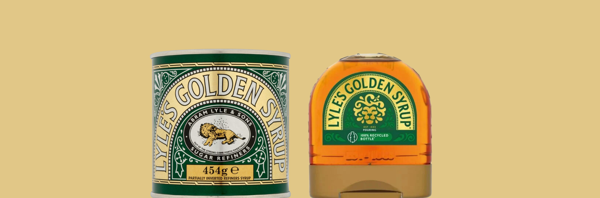
However, the company is embarking on a significant change: updating its iconic logo for the first time in over 140 years. Traditionally adorned with an image of (puts on half-rimmed glasses and holds up tin)…yep, a deceased lion surrounded by bees.
The syrup's packaging, however, is undergoing a transformation, particularly on its squeezy bottle variant. The new design introduces a more amiable depiction of a lion's face accompanied by a single bee, a departure from the previous emblem. This modernised aesthetic aims to resonate with a contemporary audience reflecting ‘the evolving tastes and preferences of consumers in the 21st century’ (presumably a demographic less chilling with the ominous hint of feline death).
In addition to the visual overhaul, the familiar slogan "Out of the stinging came forth sweetness," which has long accompanied the original image, has been omitted from the updated packaging. This strategic decision aligns with the brand's efforts to refresh its identity while maintaining relevance in today's market landscape.
While the revamped design will extend to other Lyle’s Golden Syrup products, such as its Golden Syrup Cake, the classic tins will remain unchanged, preserving the brand's heritage and nostalgia for loyal consumers.
The original logo and slogan, conceived by the syrup's Scottish founder Abram Lyle, draw inspiration from a biblical tale featuring Samson from the book of Judges. The narrative recounts Samson's encounter with a lion, which he subsequently discovers inhabited by a swarm of bees, yielding honey. The slogan, "Out of the eater came forth meat and out of the strong came forth sweetness," alludes to this biblical riddle, adding depth and symbolism to the brand's imagery.
Following the acquisition of Tate and Lyle Sugars by American Sugar Refining (ASF) in 2010, James Whiteley, brand director for Lyle’s Golden Syrup, emphasised the importance of evolving to meet contemporary consumer expectations. While the brand remains committed to honouring its original heritage through the preservation of the iconic tin design, Whiteley underscores the necessity of adapting to modern sensibilities.
Our take
There’s a lovable ‘look and feel’ to the food brands that cultures cherish, and the fonts and graphic choices say a lot about national characteristics.
A recent trip to a Cotswolds-based tea house – which featured walls decorated with nostalgic paraphernalia that would occupy a typical British kitchen in the 1950s – prompted memories of my childhood in the 1980s, where the older generation would still fill their cabinets with the distinctive wartime comfort foods: Bovril, OXO, SPAM, and, yes, Lyle’s Golden Syrup.
Upon meeting my Brazilian wife meanwhile, I discovered a whole new world of regional logos: including Guarana, Pacoquita and Pilao coffee. There’s a joy in seeing a little bit of Brazil in her Hammersmith home.
This is all to say that Golden Syrup’s traditional tins are not ‘just a product’. The decision to modernise the logo marks a pivotal moment for Lyle’s Golden Syrup, signifying a balance between honouring tradition and embracing change. With its refreshed, contemporary identity, the brand endeavours to resonate with a new generation of consumers while retaining the timeless appeal that has earned it a place in the annals of Guinness World Records as the holder of the oldest unchanged brand packaging, a testament to its enduring legacy.
The new design is clean and striking, and its newfound spotlight provided a moment to reflect on a classic design. The logo is still a bit weird, mind, but overall, we’re glad they left the tin version unchanged.
If you enjoyed this article, you can subscribe for free to our weekly email alert and receive a regular curation of the best creative campaigns by creatives themselves.
Published on: