

Heal's positions itself as a design authority
In a defiant stand against algorithmic sameness, furniture retailer Heal’s has undergone a brand refresh that combines great copy, passion and a focus on individuality.
Those pesky algorithms have been trying to fob you off with disposable decor and fleeting interior trends for too long now, to paraphrase Heal’s, making you appear quite the off-trend fool in the time it takes to scroll to your next reel.
The storied British furniture brand has remained the epitome of quality and style since 1810, so it might have a thing or two to teach fly-by-night influencers keen to tout their soulless beige hellscapes.
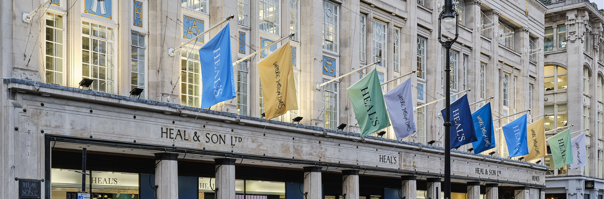
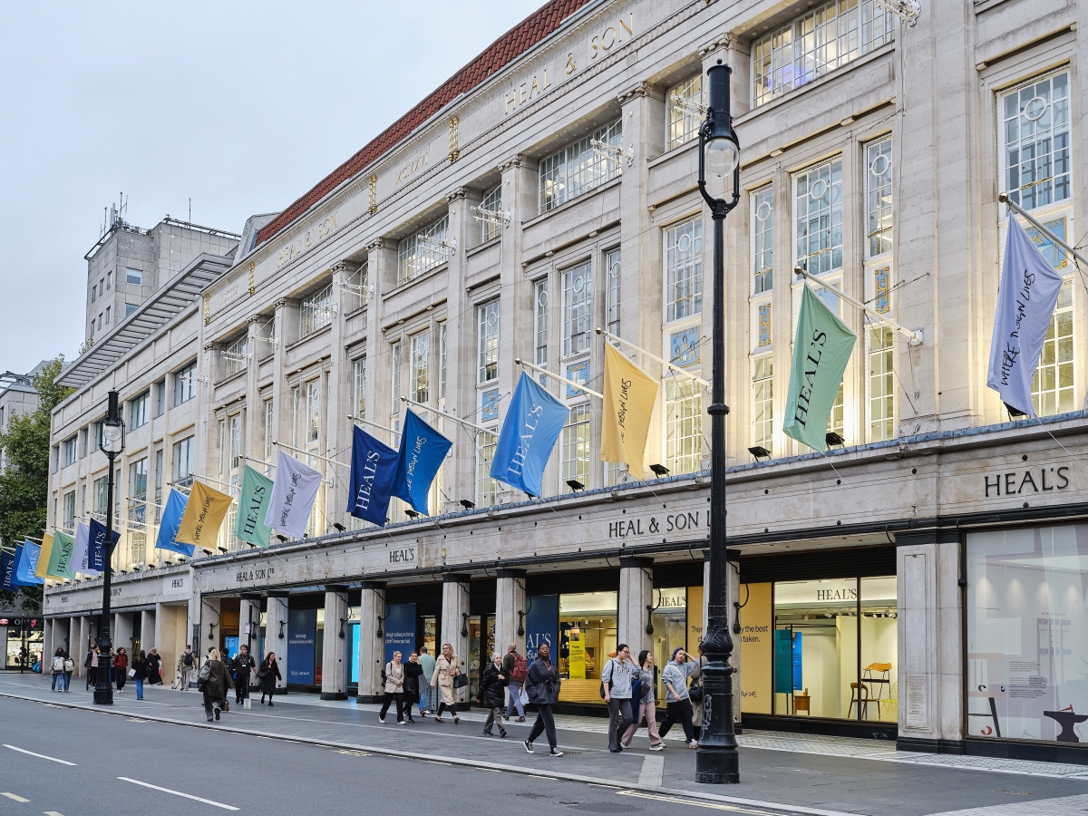
‘Where Design Lives’ is the campaign Heal’s is rolling out: celebrating creativity, craftsmanship, and individuality. Launched on September 18th during London Design Festival, the initiative, a collaboration with independent brand strategy consultancy Tomorrowism, creates a sharp new visual identity with a witty yet authoritative voice that champions individuality in an era of cookie-cutter interiors.
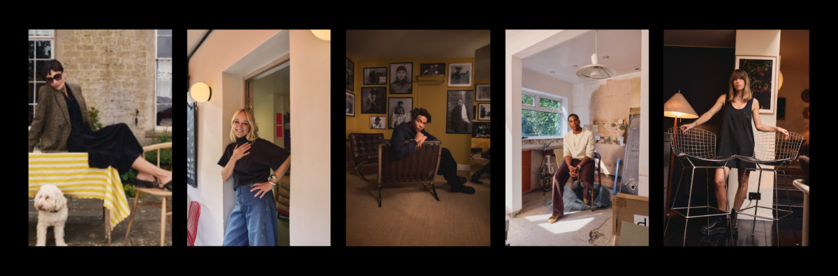
Heal’s has teamed up with five cultural luminaries, each a champion of design’s emotional and functional impact, to challenge the homogenisation of British homes.
Filmmaker Reggie Yates, Net-A-Porter’s global head of styling Harriet Haskell-Thomas, textile designer and ex-musician Pearl Lowe, master tailor Charlie Casely-Hayford, and celebrated baker Claire Ptak of Violet Cakes all share their passion for furniture in a mini-documentary series, showcasing how design crafts deeply personal, autobiographical homes.
Backed by a £1m investment, the campaign spans curated OOH billboards, print ads in ‘Elle Decoration’ and ‘Dwell’, and in-store “design labs” where shoppers can experiment with virtual room setups. Social media amplifies the documentaries with shoppable edits featuring the tastemakers’ favourite Heal’s pieces, from mid-century designs to modern exclusives.
Early buzz is strong: pre-launch teasers hit 600,000 impressions, and festival activations saw a 35% spike in store visits.
Our take
I went to see Heal’s campaign ‘IRL’, as influencers might say, and was charmed by the generously sized store’s pithy window display copy and excellent furniture.
Given that I’m currently renovating my own home, I’ve picked up a few style tips along the way that Heal’s has always adhered to. The emphasis on quality is important because people can… just tell. Indeed, if you pick up a piece from the brand’s collections second-hand from yesteryear, it’ll still look on point today.
I’m also a fan of homes that use a bit of colour, show some personality, and don’t go in too hard on one design style. Heal’s settles predominantly on Mid Century Modern, but breaks the rules with off-kilter colours and bold design often enough to avoid easy categorisation.
We’ve endured a few nightmarish eras of design, but Heal’s never wavered. Clips from 90s DIY show Changing Rooms are now shared as comedy, and the 2010s didn’t fare much better, opting to wash homes in John Major grey. Indeed, even the dull-but-pragmatic ex-Tory leader has stood the test of time better than this regrettable trend.
The £1m investment, Heal’s biggest since a 2010s digital pivot, signals confidence amid a tricky retail landscape, where UK furniture sales dipped 2% last year (BRC). I still reckon spending a chunk on some timeless furniture is less scary than a Rachel Reeves budget, however. And certainly more appealing than a knock on the door from Handy Andy.
All images courtesy of Heal's PR team.
If you enjoyed this article, you can subscribe for free to our weekly email alert and receive a regular curation of the best creative campaigns by creatives themselves.
Published on: