

How Skyscanner's brand design stays consistent across 47 markets

We caught up with James Bradley, part of the brand design team at Skyscanner, to discuss maintaining a unified brand across 47 global markets with a "principle-led" approach to navigating cultural nuance
Bradley believes creativity extends beyond marketing campaigns into product features.
Here, he shares how features like the 'Explore Everywhere' tool embody this, as well as his creative inspirations, including the pioneering brand work of Klarna, Mailchimp, and Pinterest.

Tom Hall (TH): How would you define Skyscanner’s brand design and how do you keep it consistent on a global level?
James Bradley (JB): Skyscanner’s Brand Design function is a close-knit team of just over ten designers located across four global hubs. Despite the distance, we are united by a shared culture rooted in craft, passion, and a mindset that blends entrepreneurial thinking with a commitment to raising the bar in everything we create.
Consistency in our global brand design comes from having a clear, disciplined foundation rooted in Swiss design principles. These principles give us a universal visual language built on structure, clarity, and intentionality.
By leaning into grid systems, strong framing, balanced layouts, and bold, purposeful typography, we’re able to create a look and feel that remains instantly recognisable, regardless of market, format, or team producing the work.
Our design system acts as the connective tissue that holds everything together. The grid provides a repeatable framework that travels well across cultures and content types. Our typography choices reinforce hierarchy and readability, ensuring our message cuts through with confidence. Colour, motion, and imagery guidelines work in harmony to maintain coherence without limiting creativity.
Because these elements are principle-led rather than trend-led, they scale globally. They enable teams in different regions to express the brand authentically while staying aligned to a shared visual DNA.
This reduces fragmentation, builds brand equity, and ensures that wherever someone encounters us, online, offline, or in product… they experience the same level of craft, clarity, and trust.
In short: our Swiss-informed foundation gives us both consistency and flexibility. It empowers every team to design with confidence, and it ensures our brand shows up with the same distinctive voice, everywhere in the world.
TH: What are the regional differences you have encountered and how was this information researched?
JB: Skyscanner operates in 47 markets, and projects like Travel Trends launch across up to 19 of those markets in 12 languages. The world is incredibly diverse, and we believe our creative work should reflect that richness rather than defaulting to a UK-centric view. To achieve this, we draw on a wide network of perspectives: our own global experiences as a team, the insights of colleagues across our 9 international offices, and the deep cultural expertise of our localisation partners.
We collaborate closely with localisation from the very start of the creative process, sharing art-directional briefs so we can gather their input on everything from colour choices and styling to props and language. This ensures cultural nuance is embedded early, not retrofitted later.
One challenge was that we had to find ways of communicating the world around each trend without relying on language or type, as we only had one set of artwork deliveries. It pushed us to look into the graphic motifs that represented each one and to create Skyscanner's way of doing them.
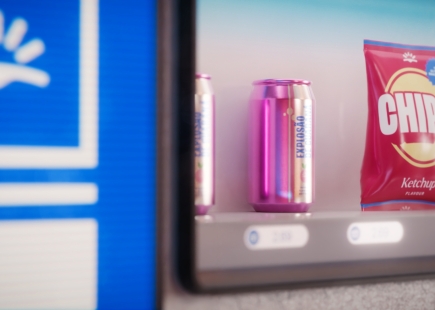
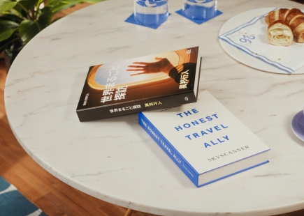
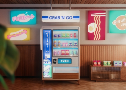
You can see this approach clearly in the Travel Trends art direction. Each scene incorporates regionally relevant palettes, languages, props, and visual cues to reflect the diversity of global travel culture. For example, the Shelf Discovery trend blends languages, snacks, and visual styles inspired by convenience-store culture around the world. Meanwhile, the Glowmads trend highlights South Korean and French beauty influences, with packaging and product design appearing authentically in Korean, English, and French—creating a scene that feels genuinely global, not generic.
TH: Which Skyscanner products do you think demonstrate the brand's creativity and why?
JB: Our products are designed to empower travellers by making planning and booking simple, intuitive, and enjoyable. Creativity at Skyscanner is not limited to our campaigns—it extends directly into our product ecosystem across flights, hotels and car hire. We focus on reducing complexity and presenting information in a way that feels effortless for users.
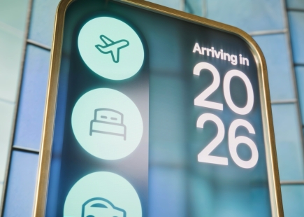
A great example of this is our Explore Everywhere tool. It showcases the brand’s creativity by transforming vast amounts of travel data into a clear, inspiring experience. Travellers can browse destinations ranked by price, directness of routes, or trip type—whether they are looking for a beach break, an arts and culture weekend, or something entirely spontaneous. It takes something inherently complex and turns it into a simple, delightful discovery moment, which is very much at the heart of Skyscanner’s design philosophy.
TH: What are your inspirations as a creative, and which campaigns have appealed to you?
JB: As both travellers and creatives, we as a team take most of our inspiration from the real world. Exploring new places, noticing design techniques, styles, and the subtleties of different places, experiences, cultures and subcultures all feed directly into how we approach design. We’re equally inspired by the diversity within our own Brand Design and wider Skyscanner teams—the mix of backgrounds, perspectives, and lived experiences enriches everything we make. Whether it is a piece of typography spotted on a street corner or a candid moment observed while travelling, these everyday details often spark the best ideas. A great example of this kind of observed world is Tripod City, street photography, which we as a team are obsessed with – exploring the world with a completely different street photography lens.
A recent campaign that really resonates with me is the Dunkin’ Donuts work crafted by Buck. It is full of warmth, character, and meticulous detail—each frame feels like a fully realised world. That level of depth and storytelling aligns closely with what we aimed to achieve in the Travel Trends art direction. From localised books to the characters on vending machines, every element was intentionally crafted to create immersive scenes that reflect the richness of global travel. These layers not only make the worlds feel authentic, but also give us the flexibility to adapt and scale the campaign across markets.
TH: Are any other brands doing what you are doing well? And which brands' marketing efforts/creative do you admire?
JB: Historically, I have always admired the work Mailchimp produced through its internal agency, Wink Creative. Their ability to inject playfulness, personality, and unexpected creativity into every touchpoint set a strong benchmark for in-house brand craft.
More recently, the brands that inspire me most are Klarna and Pinterest. Klarna, in particular, stands out for the way it transforms fintech into something kitsch, youthful, and highly accessible—yet always with a sense of flair. Everything from their pack shots to the cohesiveness of their wider brand world feels considered and beautifully executed.
Pinterest also continues to impress with its ability to balance utility and inspiration, creating a visual ecosystem that feels both expansive and deeply personal. These brands push the boundaries of how identity and storytelling can come together, and that ambition resonates strongly with the work we strive to do at Skyscanner.
If you enjoyed this article, you can subscribe for free to our weekly email alert and receive a regular curation of the best creative campaigns by creatives themselves.
Published on: