


IKEA says a lot with a little, but maybe there’s more to it?
Ikea has continued its legacy of creating work with agency Mother that succinctly conveys the core appeal of the brand. The simplicity, however, is all part of a sophisticated strategy.
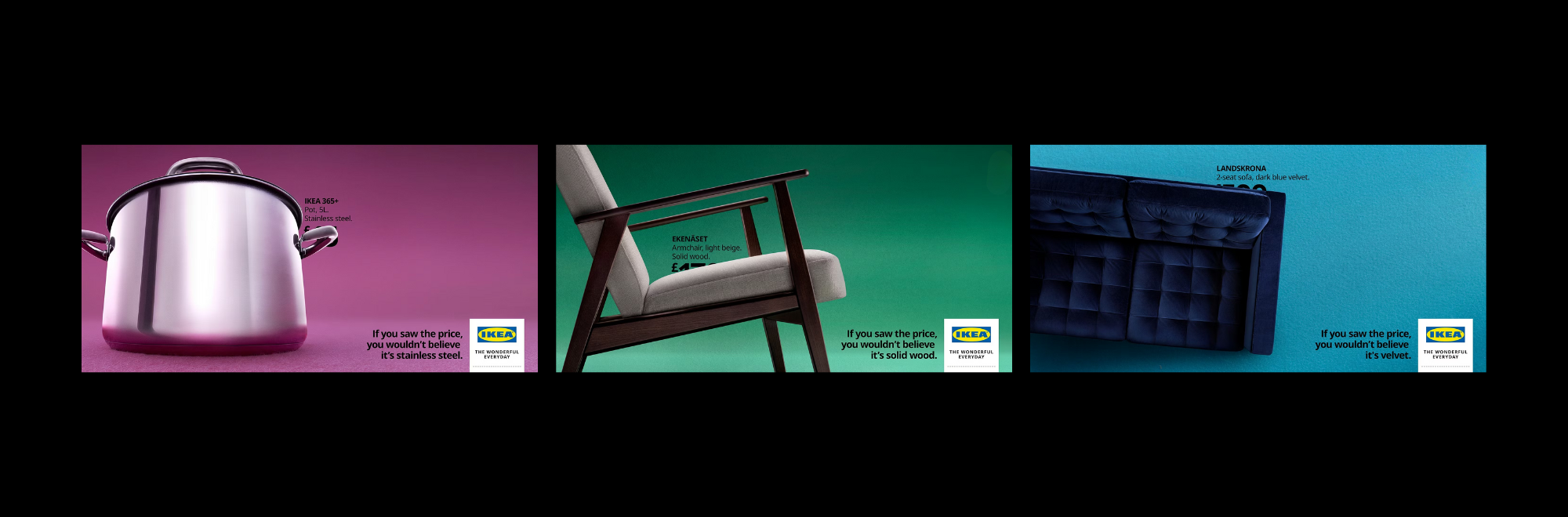
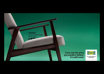
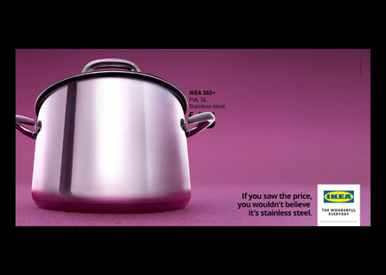
A simple line, a price, a knowing visual and just enough self‑awareness to raise a wry smirk. IKEA’s ads often follow this sort of formula, but the recent efforts were particularly striking in their simplicity and economy.
Each ad features striking products shot from jaunty angles, with contemporary backgrounds. The text, meanwhile, is set in an intriguing position, drawing attention to the price (hidden to create intrigue) and the quality of materials/build.
While it might sound like I’m overthinking a simple ad (wouldn’t be the first time), there is a well-documented literature on Ikea’s strategy. Harvard Business Review’s ‘How IKEA Creates a Sustainable Competitive Advantage’ explains how the brand focuses on affordability from the outset of product development, integrating cost control into the design process.
The rapid expansion of Ikea, meanwhile, was always tempered by an ethos that innovation must follow with every new store opening.
IKEA’s consistency
We recently ran a piece that looked at another brand’s timeless aesthetic, in this case, Gap. But Ikea can certainly compete in terms of having a consistent throughpoint to its ads.
The recent campaign might lack the wow factor of Gap’s commercials, but it nonetheless plays well at a time when many face cost‑of‑living anxiety, and when competition from the likes of Wayfair and Etsy has forced a strategic focus on materials.
IKEA knows what it’s doing, and it’s doing it well.
If you enjoyed this article, you can subscribe for free to our weekly email alert and receive a regular curation of the best creative campaigns by creatives themselves.
Published on: