


Miscarriage ad draws attention to an overlooked struggle
“No One Should Go Through Pregnancy Loss Alone”, says agency Shape History, whose latest ad with Miscarriage UK is an effort to make this a reality.
This is not a campaign in the conventional sense. Instead, it’s a reimagining of how a nation understands and talks about pregnancy loss.
Ed Fletcher, CEO at Shape History, said: “Last week the new brand of Miscarriage UK was revealed, and I am beyond proud to see this work out in the public.
“From when we first received this brief, the Shape History team fully grasped the significance of what this subject matter brings, and the sensitivity that was required to evolve the brand. So involving people with lived experience, healthcare professionals and the partners of those affected in the creative process was an absolute essential.”
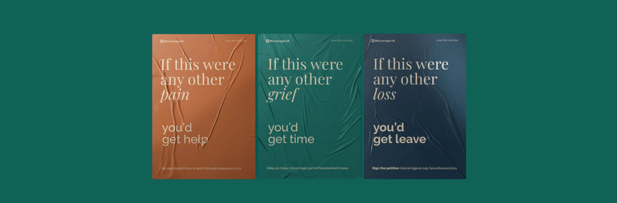
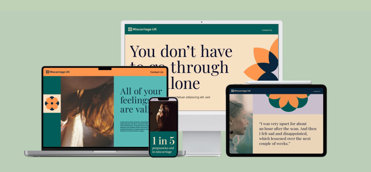
Miscarriage remains far more common than many people realise, with 1 in 4 pregnancies ending in loss and 1 in 5 to miscarriage.
Its prevalence, Fletcher says, is still too often hidden, minimised or surrounded by silence, leaving many people to process grief, confusion and uncertainty without the recognition or support they need.
The narrative
At the heart of the work is the message that miscarriage is common, yet profoundly isolating.
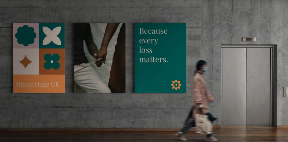
The rebrand reframes the organisation from a trusted but quiet support network into a visible, emotionally resonant platform for connection.
The idea that anchors everything, the phrase ‘held together’, captures both individual experiences and the collective support people need when navigating them.
The identity includes a crochet-inspired visual system with individual shapes representing ‘personal stories’, stitched together into a ‘protective whole’.
Its soft, layered colour palette, meanwhile, balances ‘warmth with sensitivity’, allowing ‘space for grief, uncertainty and empathy’.
The shift in naming from Miscarriage Association to Miscarriage UK meanwhile, moves the organisation from institution to national reference point, broadening its reach and authority.
Understated but powerful
This work is notably restrained. There’s no shock tactics, or statistic-led provocation. Instead, it reflects on lived experiences.
The crochet metaphor is particularly powerful. It avoids cliché and suggests community care and resilience while being rooted in craft, domesticity, and the idea of shared experience.
“Every loss deserves to be heard. Every journey deserves to be held,” reads the brand’s statement. It’s hard to disagree that Shape have captured that here.
If you enjoyed this article, you can subscribe for free to our weekly email alert and receive a regular curation of the best creative campaigns by creatives themselves.
Published on: