

The thinking behind Koto Studio’s Amazon rebrand
Rebranding one of the world’s biggest, and increasingly diversifying brands is no small task. So how did Koto Studio fare?
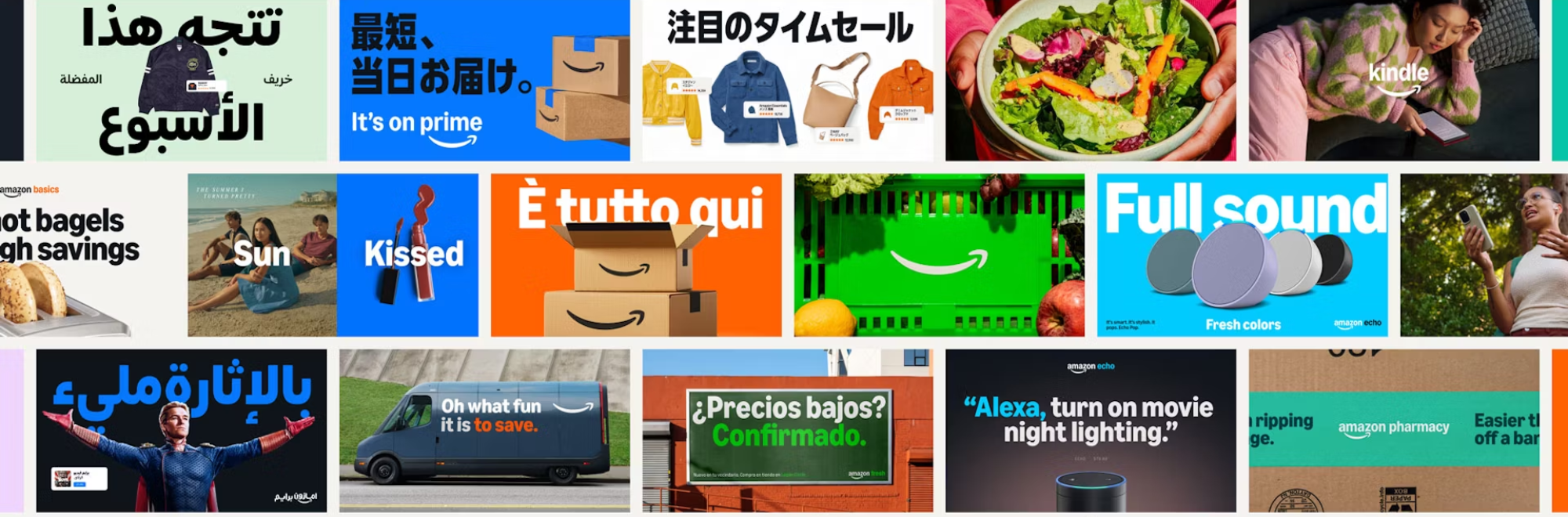
In a significant move to unify its global identity, Amazon rolled out its most extensive brand update in over 25 years, spearheaded by design studio Koto. Taking 18 months to complete, spanning 15 global markets and covering over 50 sub-brands, the challenge was to reflect Amazon's ‘expansive reach and diverse offerings’. And presumably, to keep Mr Bezos sweet.
Unified approach
Amazon, as we all know, has been scaling at an extraordinary pace. Its cohesiveness was apparently a victim of this success, necessitating a refreshed ‘brand system’ to unite its creativity.
With ownership often fragmented across teams, regions, and experiences, Koto collaborated with Amazon’s in-house brand team, Amazon XCM, to approach Amazon’s most iconic assets. The result is a confident, consistent identity across every touchpoint.
Key elements
The rebrand includes the first update to the Amazon logo in over 20 years. While the beloved arrow that signifies Amazon's ability to deliver everything from "A to Z" remains, the new design places greater emphasis on a ‘deeper and more emphatic’ smile.
This idea here is to put a smile on the faces of Amazon customers, whose lives have no doubt been made easier, whether they are shopping online, streaming content, or using Amazon's various services
A custom typeface is also included. Koto introduced Amazon Logo Sans, which provides a ‘unified, scalable system for every sub-brand’ and future initiatives. The rebrand also features a unified colour palette.
Beyond aesthetics
The rebrand was about simplifying and unifying a brand that operates in nearly every imaginable category. By refining the core logo and creating a consistent, manageable logo system, Koto and Amazon have set a new benchmark for brand consistency and innovation.
The new identity puts a literal ‘smile’ in front of customers, whether they’re shopping in the Amazon app, getting next-day delivery, watching content on Prime Video, streaming on Amazon Music, or receiving their prescription at Amazon Pharmacy.
Our take
The pressure of Koto here must have been fairly immense, and the turnaround time for such a project is impressive. We like how the branding is still familiar, yet a lot more cohesive, organised and approachable.
If you enjoyed this article, you can subscribe for free to our weekly email alert and receive a regular curation of the best creative campaigns by creatives themselves.
Published on: