

What Paris 2024’s Paralympic campaign tells us about its brand vision
Paris 2024’s latest Paralympics advert goes from cute to hard hitting in the blink of an eye, with a little help from Paul McCartney. But what does it tell us about the organisation’s wider goals?
It’s been over a year since the logos, pictograms and text for the Paris 2024 Olympics were unveiled, but any glimpse into the organisation’s visuals is always eagerly anticipated.
Made for the International Paralympic Committee by adam&eveDDB, 'The Paralympic Dream' is billed as an example of how sport changes perception. Indeed, according to the creative agency’s research, when talking about the Olympics, people used the word "competing' but when talking about the Paralympics, they said "participating".
The ad is set to the tune of Paul McCartney's 'We all Stand Together', which places the ad in an irreverent, playful mode… well, until 37 seconds in, when the tone takes an about turn.
What we know about Paris’ visual identity so far
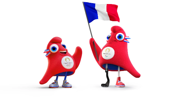
Mascots are always a big deal when it comes to drumming up hype. ‘The Phryges’ are described as fun red characters based on the notorious French Phrygian cap, symbolising freedom and revolution. The Phryges’ visual identity is described as ‘dynamic and engaging, just like their personalities’, illustrating their aim to get French people moving every day until the Games.
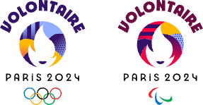
The volunteers, of course, have taken a leading spot in recent Games and play an important marketing role for championing the good will behind any contest, and Paris is no different. 45,000 people will welcome, direct, and guide spectators, and even help athletes perform at their best. The visual identity of the volunteer programme emulates the ‘energy and diversity’ of the people who will contribute to the success of the Paris 2024 Games.
The traditional mainstays, meanwhile, will of course include The Paris 2024 Olympic Torch Relay and Paralympic Torch Relay, this time in the form of the “Forerunners Relays” before the Games in 2024. These events will lead the way to the celebration of the Games and showcase the ‘natural and cultural heritage of France’.
The visual identity of the Forerunners Relays is based on the Paris 2024 logo, with a shape that ‘evokes resonance—mirroring the energy emanating from the Games and its values, as a flame spreads its light’.

Our take
There’s some decidedly ‘Gallic’ touches to the Paris 2024 branding kit, notably the curvaceous font kit, created especially for the event (and named after it).
The Paris 2024 emblem doesn’t break any major design conventions, but simply combines three distinct symbols: the Gold Medal, the flame and the Marianne: the personification of the French Republic, representing national identity and values.

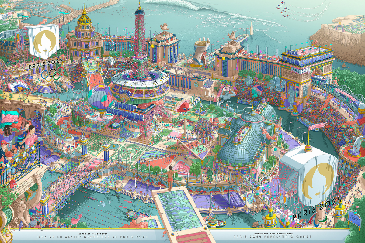
Its posters, meanwhile, are a departure from minimalist design. They feature over 40,000 characters and a meticulous attention to detail by illustrator Ugo Gattoni. We love them, incidentally!
The guiding principles of the branding are to champion the idea of integrating sports into the urban environment, tell impactful stories, and celebrate inclusivity. Overall, the idea is to juxtapose modernity with a timeless heritage, and we reckon they’ve made a fair effort at this.
We might be biased though, but overall, the London 2012 still stands out as the go-to branding success of recent years. Its logo and fonts initially struck us as gauche and lurid, but over the months leading up to the Games, the insignias really came into their own. Paris is playing it a little safer, with its main identity kit at least, but that’s no bad thing.
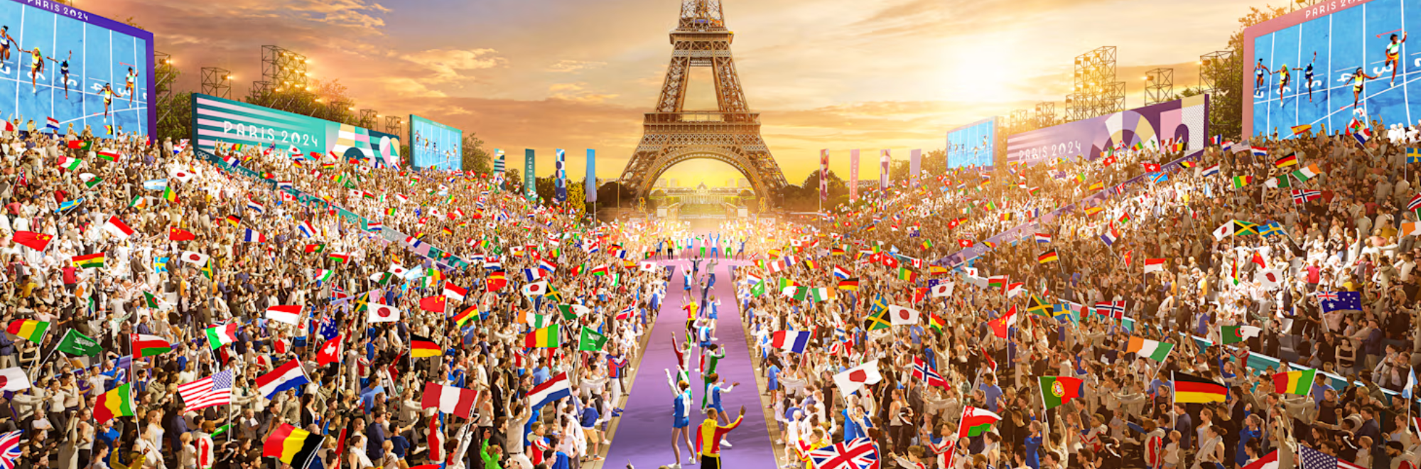
Lead image by Paris 2024.
If you enjoyed this article, you can subscribe for free to our weekly email alert and receive a regular curation of the best creative campaigns by creatives themselves.
Published on: