


Coca-Cola becomes even more Coca-Cola

Coca-Cola’s rebrand proves the hardest design decision is doing less.
There are a lot of chefs in the kitchen for Coca-Cola’s recent rebrand, but don’t mistake that for some radical cooking. JKR, with contributions from SUPERULTRARARE, Monks, forpeople and Brody Associates, were among the contributors to what is a fairly weighty project given the brand’s stature.
Most rebrands begin with dissatisfaction, but that can hardly be said of Coke. The project, which thankfully keeps the swirly logo intact, follows the core philosophy of, as Rapha Abreu, global VP of design at The Coca-Cola Company, summarised it: "Making Coca-Cola more Coca-Cola."
Visual upgrades
The design overhaul, spearheaded by agency JKR, dials up the prominence of classic brand elements to make every product and advertisement instantly recognisable.
The Dynamic Ribbon, or the white "swoosh" (first introduced in 1969), has been given a more prominent, active framing role across packaging and digital media. The classic red box framing element has been revived and refined to anchor layouts.
A "Better With" custom typeface has been added, designed by Brody Associates. This custom serif font blends the brand’s historic heritage with contemporary digital readability.
The new product imagery uses clean, vibrant visuals from commercial photographers Guy Aroch, Anna Palma, and Martin Wonnacott. Flavoured varieties (like Cherry or Vanilla) now include the fruit graphic directly into the logo canvas for clear navigation.
Can layout changes
The worldwide packaging system, conceptualised by The SUPERULTRARARE, addresses the physical reality of selling 2.2 billion beverages daily.
The flagship Coca-Cola cans pivot the main Spencerian script text into a clean vertical orientation. Coca-Cola Zero Sugar had an overhaul too: The Zero Sugar line sheds its mostly black canvas and now features a white logo, a distinctive bold black Dynamic Ribbon wrapped around the can, and black bottle caps on PET plastic variations.
Digital tweaks
The true innovation of the project isn't just the design; it's how it is maintained at scale.
The Brand Center, built by agencies for people and Monks, provides a standardised way for internal teams to manage brand assets globally.
Meanwhile, a ‘Project Fizzion’, built in partnership with Adobe, sees AI-powered governance tools trained explicitly on Coca-Cola’s design archives. This allows local marketing branches to instantly generate compliant, on-brand creative assets for vending, retail, and digital ads while locked strictly within the new guidelines.
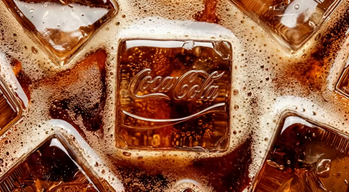 Image credit: JKR/The Coca Cola Company campaign film
Where are rebrands at in 2026?
Perhaps the most controversial rebrand of the decade was, of course, Jaguar, which abandoned much of its traditional luxury-car imagery in favour of a minimalist wordmark, fashion-inspired visuals and the "Copy Nothing" positioning as it shifted towards an all-electric future.
The brand bet its entire future on this, and you might want to check in on how that’s going.
A much safer approach was taken by Amazon, whose first significant brand refresh in around 20 years was deliberately subtle. Working with agency Koto and its in-house team, the company refined its famous smile arrow, updated typography and created a more coherent design system across its huge ecosystem of products and services.
We covered it in some detail here. OpenAI also got in on the act, a bit sooner than Amazon given its short history. It introduced a broader visual identity refresh, including updated typography, colour systems and brand assets as it evolved from "the company behind ChatGPT" into a much larger AI platform.
Our take
It’s been a month now, so we’re used to seeing the new design IRL. The cleaner look works well, with a distinctly retro bent, harking back to the 80s era when Coca-Cola’s straplines were succinct, aspirational and broad.
We can't help but think of a certain red cigarette brand, however, when looking at the font. But it still pops, regardless.
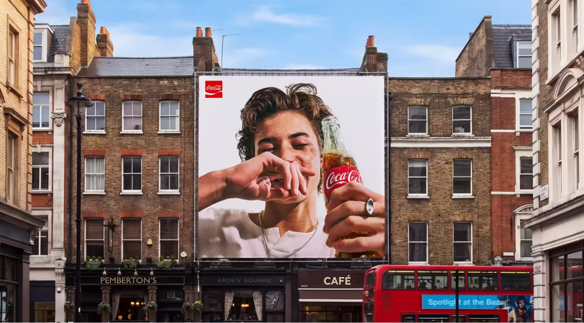 Image credit: JKR/The Coca Cola Company campaign film
If you enjoyed this article, you can subscribe for free to our weekly email alert and receive a regular curation of the best creative campaigns by creatives themselves.
Published on: