


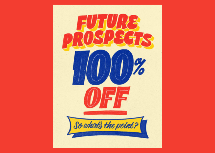
‘Heinzeken’ and the fine pedigree of World Cup-inspired print campaigns

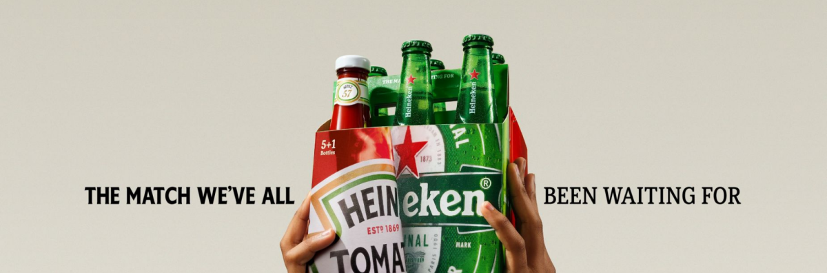
Heinz and Heineken have introduced a limited-edition six-pack combining five beers with a bottle of ketchup. But it’s not the only captivating 2026 World Cup-themed print campaign.
We’ve certainly seen more tenuous co-branding efforts than the Heinz/Heineken collab, which is built on a commonality: that the two brands already coexist at BBQs and social gatherings.
What makes this particularly relevant, however, is how closely it aligns with broader trends in World Cup 2026 advertising. Print and poster-led work is still very much alive, and indeed treated with the esteem it deserves.
FIFA hits us in the feels
FIFA’s official 2026 host city posters are a fine example of printed perfection. They lean heavily into local identity and recognisable cultural symbols, from flamingos in Miami to whales in Seattle, each translating something already known about a place into a bold visual language rather than inventing a new narrative.
The official tournament poster itself is also notable, created collaboratively by artists from the three host nations to reflect their ‘shared passion and unity’.
Nike effort
Brands have stepped up to the printing plate, too.
Nike’s World Cup 2026 kit launch was accompanied by a series of cinematic posters, each designed to express the cultural identity of each national team, with slogans and imagery rooted in how fans already perceive those teams.
Print pedigree
Perhaps because Creative Moment is run by people rooted in the heyday of printed media, we can’t help but fanboi (and fangal) a good paper-based product.
Print, we believe, shouldn't be treated as a secondary channel, but revered for its visual craft.
Anyway, here are a few recent print successes we’d like to celebrate.
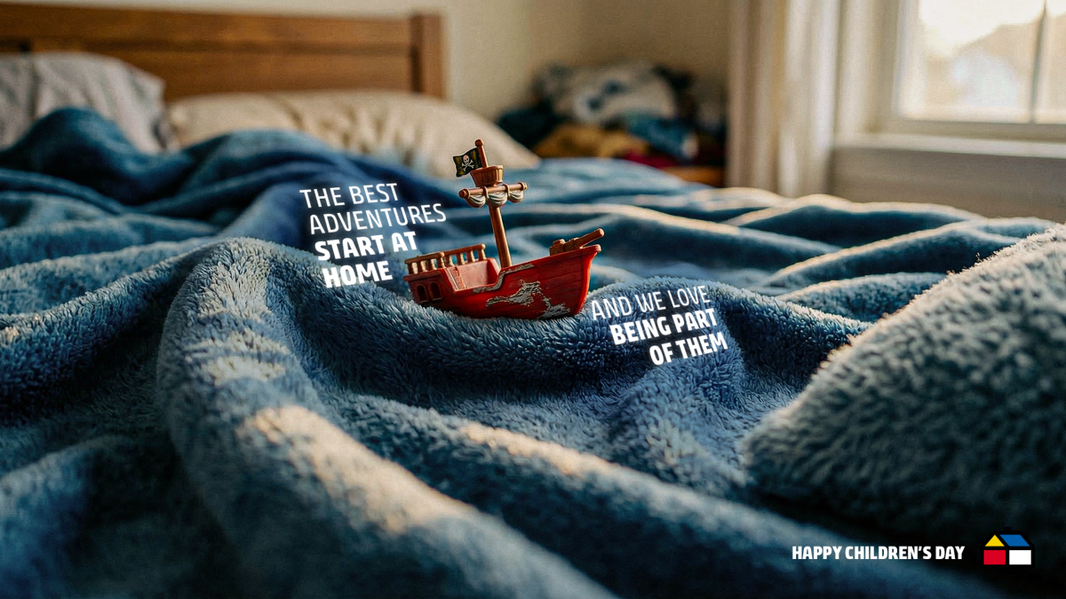
Sodimac’s (a home improvement and hardware retail chain in Latin America often described as a mix of Homebase and IKEA) World Children’s Day campaign shows affection for print through its immediacy.
With minimal copy, the visuals transform everyday rooms into imaginative worlds, proving how print can communicate an emotional idea instantly.
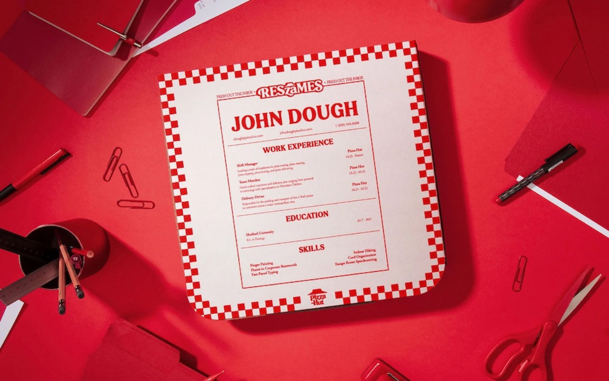
Pizza Hut perfects print
‘ResZAmes’ placed CVs on pizza boxes. Rather than competing digitally, it used print’s physicality to cut through noise, landing directly in employers’ hands.
A print Triumph
Triumph’s campaign showcases affection for print through craft and composition. Using chronophotography, each image captures movement forming the shape of a sports bra.

Oli Frape gets back to basics
Frape’s hand-drawn posters celebrate print as a nostalgic, human craft. By referencing vintage signage, the work celebrates the imperfection and personality of handmade typography, reminding us of print’s roots in street-level communication.
Renaissance revival
Across Ferragamo, Lidl and StreetEasy’s work, print became a way to merge classical art with modern messaging. These campaigns draw on Renaissance aesthetics, demonstrating how print can function as a gallery-like space in everyday life.
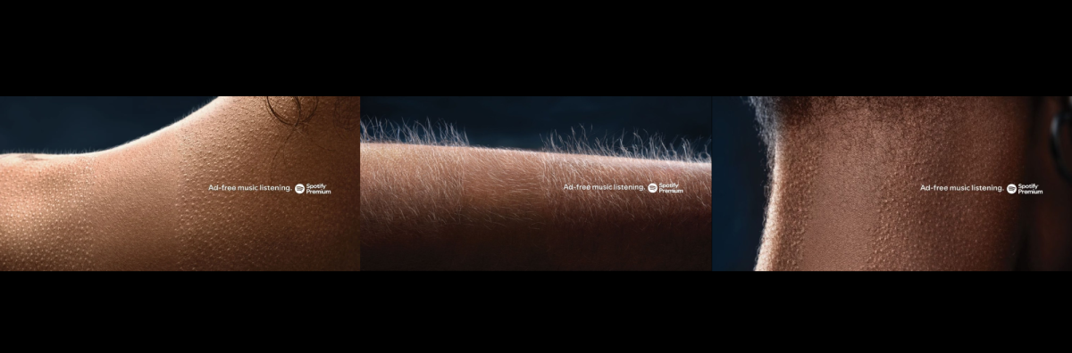
Spotify: print as emotional theatre
Lastly, Spotify’s series highlights print’s power to be cinematic without motion. By capturing visceral, physical reactions to interrupted listening, the campaign shows how a single still image can deliver sensory storytelling.
If you enjoyed this article, you can subscribe for free to our weekly email alert and receive a regular curation of the best creative campaigns by creatives themselves.
Published on: