

Mind the crest: why heritage reigns supreme in university logos

Louise Brown, director of Mammoth Education, explains why educational institutions often stick with or return to traditional emblems for their logo, even as other industries move decisively away from the past.
Today’s headlines make for depressing reading when it comes to the value of university degrees. A graduate jobs crisis, AI making entry-level roles redundant and student loans that will never be repaid. Most people would be better off avoiding higher education altogether, right?
Graduate regret is, in fact, wildly overestimated. A study by King’s College London last year found that while the public believed 40% of graduates wouldn’t go to university if making the choice again, the real figure is just 8%.
But public perception matters and universities must work harder than ever to prove their relevance. In such a context, it may seem strange that even when universities embark on large-scale rebranding, their logo may come out looking fairly similar to how it looked before. And, more often than not, it’s a crest or some other heraldic symbol. Even newer universities sometimes adopt a crest logo, such as the University of Austin, founded in 2021.
As someone who’s been at the coalface of many logo decisions, I can confidently say it’s not a lack of innovation or creativity, nor a resistance to change, that’s behind the stickiness of such symbols. Rather, it’s a reflection of the diversity of stakeholders invested in a university’s brand and the enduring emotional connections they have to such emblems.
Like or loathe it, Jaguar’s rebrand had a clear aim to appeal to a different type of consumer, one that was younger and more environmentally conscious.
Universities also need to target younger cohorts, but that’s not the whole story.
Yes, they have to appeal to Gen Z and Gen Alpha as prospective students. But their branding must also resonate with their influencers - parents, teachers, and school counsellors.
A fitting example in the week of International Women’s Day is that to get more women into engineering, universities sometimes now start outreach at primary school. Yet the branding has to speak not just to young girls curious about careers that challenge gender norms, but also their parents and maybe even grandparents.
Then there are current students to think about, alumni spanning many generations, and academic and professional staff - all heavily invested in their university’s logo. Not to mention global faculty, research and industry partners, philanthropic organisations and civic opinion formers.
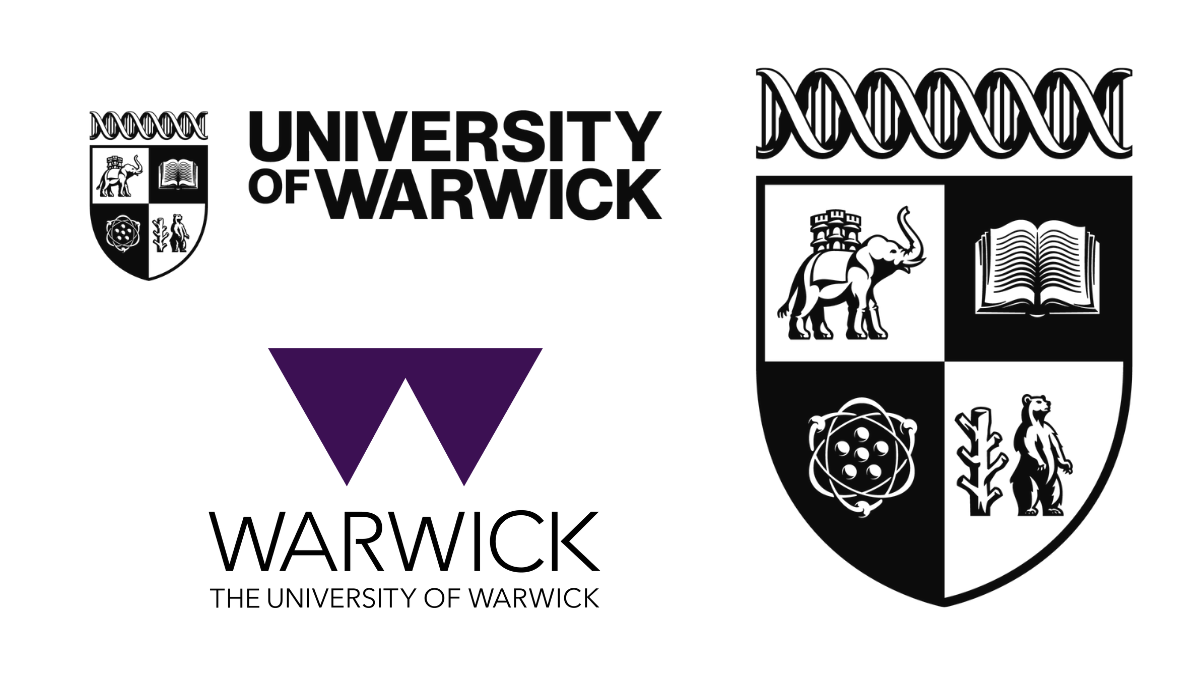
This doesn’t mean universities can’t modernise; they can, and must, to remain relevant to their younger audiences, but only to a point. When the University of Warwick moved away from its coat of arms-style logo in 2015, the purplish triangle design that replaced it was widely criticised. Last year, after consulting more than 10,000 people, it returned to a logo featuring a modernised crest, which has been much more positively received.
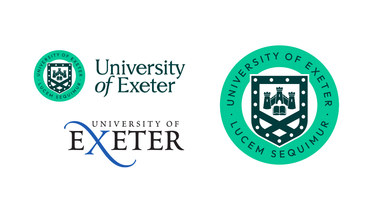
The University of Exeter did a similar U-turn after abandoning its heritage crest as the primary logo back in 2005 for a modern wordmark logo, before a revamped version of the original reappeared as part of its 2022 rebrand.
During the years in between, Exeter’s student sports societies continued to use the original for their kits, demonstrating no affinity for its replacement.
This defiance highlights the institutional nature of universities, which is similar to that of football teams. For example, Salford City FC moved away from its traditional crest logo back in 2014, replacing it with an unpopular minimalist design, but has recently announced a modernised version of the original will be used from next season.
Just as football fans are typically fans for life, university graduates are alumni for life and their university logo becomes a badge of honour that asserts their education is of a certain standard.
I believe the need for easy recognition of the implicit value of such badges will increase even further if the government’s strategy to encourage UK universities to set up campuses abroad rather than bring international students here comes to fruition.
Ultimately, if a consumer doesn’t like the new logo of a car or other product, they can move away from that brand. But if university alumni feel the same about a rebrand of their institution’s logo, they are instead more likely to demand change to protect their own brands. The trick to avoiding this is to make sure any new logo reflects not just aspiration, but also lifelong association.
If you enjoyed this article, you can subscribe for free to our weekly email alert and receive a regular curation of the best creative campaigns by creatives themselves.
Published on: