

The art of taking it slow in Hawkstone’s ad with Jeremy Clarkson
Without a related TV series, Hawkstone’s ad wouldn’t have hit as hard, but that’s sort of the point.
Four seasons of Amazon Prime’s Clarkson’s Farm have quietly built quite the following for a long-form documentary about failure and persistence in the face of unwieldy rural regulations.
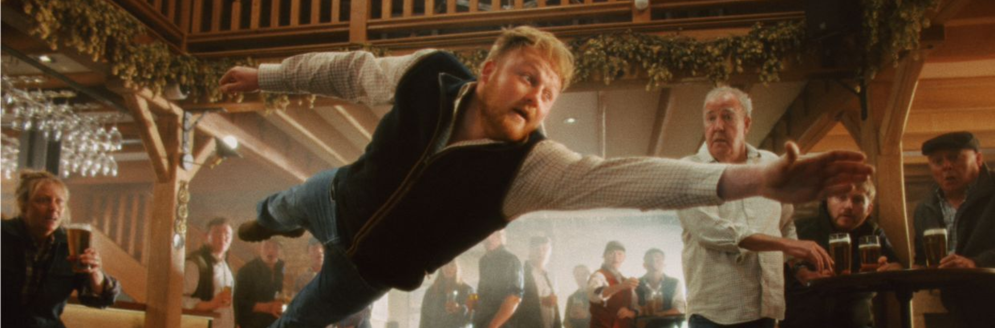
A new ad for Clarkson's beer brand, Hawkstone’s, works as an ode to this slow-motion success, using the medium of slow-mo to capture the tense moment of when a pint spills.
It’s not complex in its storytelling, of course. A pint gets knocked over. Someone dives in to save it. But the execution, which captures the familiarity of the event, is where the magic lies.
The ad is a sort of triple entendre, then, whether intentional or not.
The series succeeded by taking it slow, barley - the brand’s integral ingredient - must be brewed slowly, and the slow-motion peril of the pint mishap shows a bit of pub-based jeopardy many can relate to.
There’s an ongoing debate about how much the TV series contributes to the ad’s effectiveness. Some argue the spot stands entirely on the showmanship at play, while others insist it’s impossible to separate the two.
Both can be true. But few could argue that the presence of Clarkson and Kaleb Cooper, one of the show’s main characters, enhances the appeal for fans.
Slow burn
What then, if anything, can creatives learn by smart use of slow? Some down-tempo brand efforts might hold the answer.
Kathmandu leant fully into the trend of ‘slow living’, using ASMR-like sound design and a calming voiceover to reframe the outdoors as soft, accessible and restorative. Rather than high-adrenaline adventure, it celebrates small, everyday rituals and micro‑escapes, turning the act of going outside into something gentle rather than demanding.
Like Hawkstone’s effort, PAPAYA’s Swing uses slow-motion and cinematic pacing to stretch a fleeting moment into something meaningful. The film pauses adult life to linger in nostalgia and childlike freedom, prioritising emotional resonance and craft over speed.
Then there was the NYT’s effort, which Guy Moore wrote glowingly about in these here pages. It’s literally built around the idea of slowing down, asking viewers to “stop in their minute”. The use of timestamps, slow motion, and carefully layered sound design reframes everyday time as something worth noticing amid the noise of constant media consumption.
Slowness then, isn’t just an aesthetic. It should be used to emphasise a deeper appeal. We’ll drink to that.
If you enjoyed this article, you can subscribe for free to our weekly email alert and receive a regular curation of the best creative campaigns by creatives themselves.
Published on: