Using neurodiversity to unlock creativity: Frankie Boyle’s story

Creative Moment catches up with the visual designer Frankie Boyle, whose unique insight into the senses has helped brands including Magnum, Samsung and Hermes capture their audience’s imaginations.
Creative Moment (CM): What’s your story?
Frankie Boyle (FB): At age 7 I was diagnosed with Developmental Language Disorder, a condition that stops or hinders your processing of language: speaking, and understanding what people are saying.
I’m a big believer that if one sense is taken away the other senses improve, so I found myself becoming highly sensitive to light and people’s response to various spaces. I was in and out of several hospitals and research labs as a child, and I remember being in those spaces, trying to teach myself the language of light and how things were lit, and what made me feel safe and unsafe.
I knew I had all this knowledge, but hadn’t at this point looked into the science of it. I found out I had ADHD, synaesthesia and dyslexia, but came to realise these conditions were, in a way, helping me to see things differently.
I used to name people as colours, and have always seen colour and energy as interlinked.
This created difficulties growing up, and I was bullied at school, which led me to hold back.
My tutors at university would eventually make it clear that light and the emotional response to it was my specialism.
I became fascinated by the data of light and mechanics of emotion. I studied circadian rhythms, and the biological and psychological effect of light. It’s a never-ending fascination: providing experiences where they feel psychologically connected.
CM: Can you describe your current role?
FB: I am the glue between the art and the tech.

Often one can’t speak to the other. Artists don’t necessarily know what tech can do, how we do it, and the differences between digital to static LEDs – allowing me to apply to agencies and talk about what tech can do and its materiality and connection.
I was working on an Instagrammable wall, the agency didn’t understand the tech. I have a heightened sensitivity and object relationship understand how to bring someone on board with their brand activation, and what they are trying to sell or say and introduce new narratives. I like to make it more about people’s senses. My USP is speaking both emotion and technology.
CM: Lockdown was a pivotal moment for you, tell us how you turned a negative into a positive?
FB: Through lockdown, I had a bit of a meltdown to be honest. I wondered when my industry would ever arise, and what I was going to do. My mental health really suffered. I turned to walks, and went on one per day, and invited others to join me. I started a blog about these experiences, and Google found it, and thought it would help their employees, so I did some webinars for them about the mental health benefits, which opened my net further, and expanded my specialism beyond lights.
I also went solo, and whatever project I have now, I bring on board specialists in that area, and am happy to work on something broad, or small and bespoke. Depending on the job, I look to bring in beautiful carpenters, specialists, or whatever bits and pieces I feel suit the job. I don’t have a team. I bring on project managers adhoc. This works well as I have the opportunity to make client’s desires bespoke to the job.
CM: Do brands come to you with guidelines, or give you freedom?
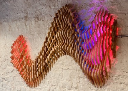
FB: It varies. I just installed my first permanent piece into the Bristol Beacon. I had full scope on the project, and the event manager wanted a piece of work to represent the building, and this led to me synchronising light with the music for the Future Proof programme the organisation does. Its brief was that it wanted something that was eye-catching and brings people in. So I did a lot of research on the building itself, and created a design that represents its energies converging.
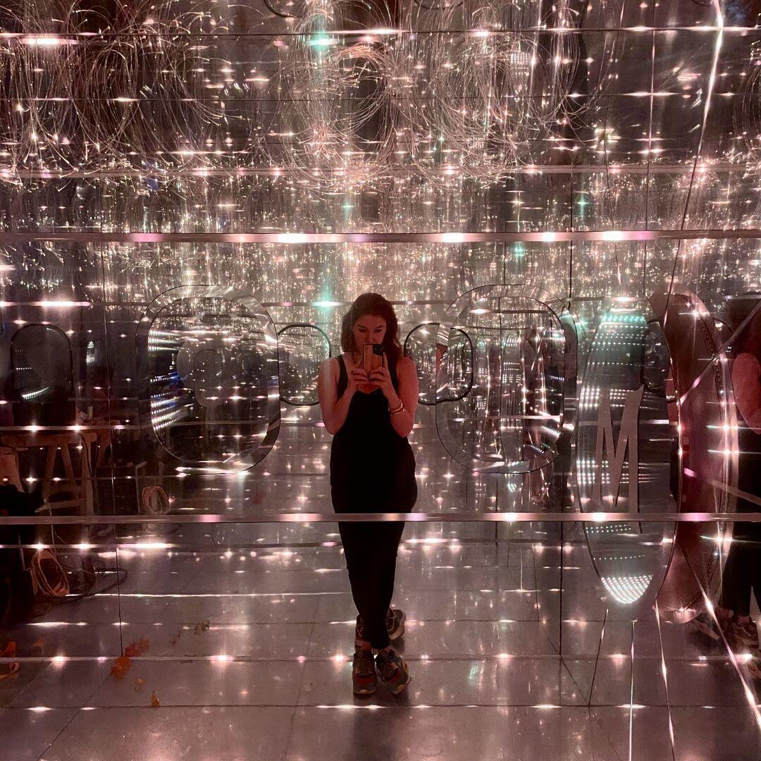
I was also bought in to work with Magnum, which were releasing two new ice creams: the Sun Lover and the Star Gazer. It said it wanted some sort of light activity involved in the installation, so I created an immersive experience for festivals featuring the inside of an aeroplane cabin, which was shooting into the universe, or the sun.
My speciality is understanding human behaviour, and to convey emotion using certain colours and movement of light.
I’m a believer that, over thousands of years of evolution, we evolved with various moving sources of light, but suddenly we’re all in an environment with static lights on walls and ceilings, and this isn’t good for our mental health.
I came up with the cabin concept, the idea of a hangar, and it so happened Magnum was looking to collaborate with NASA, so that came together nicely. It wanted the installation to include some sort of journey and wanted it to be ‘interactive’, which is a broad term. We have a phone in our pocket at all times, so telling people to press a button isn’t novel to us. So having someone feel it’s them on this journey, it needed some sort of internal connection to us. So, with this in mind, I proposed a heartbeat visual, so the activation was bespoke to the user.


CM: Do you have any tips on light use, with mental health in mind?
FB: A lot of brands use flashing lights – this gets our attention, far beyond sound, but flashing triggers our fight or flight response, and we feel aggravated and annoyed. It’s the same with intense bright white light. We’re programmed to only see bright lights at the peak of the day in summer, so bringing it into an evening vibe does not trigger the connectivity that brands and agencies want.

Not only are wavelengths important but also the temperature of colour. Sitting out in the sun is a struggle as the light is in your eyes. Bright light glare does the same thing, so you want to create a diffusion inside a space, so that the light bounces around. So look into making sure light is diffused, the angle, the time of day and harmonising these to fit your brand. The context will be different with each brand, whether they are looking to create emotions around health, sport, or a given topic.
It is important to understand that people put so much money into furnishings, colours, textures, etc, but these are nothing without the right bulb. Light inspiration can come in unexpected places: just yesterday I walked into a pub and thought ‘wow they’ve really got it right here’.
CM: Who inspires you creatively?
FB: Olafur Eliasson
is one of my idols. He looks into the emotion and connectivity to the art itself, and I relate to that: how he considers the response within the viewer.
James Turrell uses space well, considering the depth of field, and shadow.
I went to Frieze and was inspired by an artwork specialising in textures out of cocktail sticks—so beautifully together. It was interesting to see beautiful comfy-looking textures but made out of spikes. It’s an interesting way to play with expectations.
CM: What does experiential mean to you and how do you make it effective?
FB: Experiential is about making an immersive experience. I’ve been to a few experiences where it’s all working well, then suddenly the thing is taken off you. You’re in a beautiful world, then suddenly you’re in a queue surrounded by chipboard.
Team Labs is a great experiential project. It thinks about the moment from when you take off your shoes which is important to ground you, then the hallways had beautiful velvet on the walls. People try to do something cool, and then forget about the stuff around it.
There’s also often too much emphasis on stimulation. If you’re going 100mph, 110 doesn’t seem that much. We’re in an overstimulated world and brands need to realise that we need to slow things down.
There was a catwalk show by Balenciaga that was beautifully done with LED screens above the audience showing a sea of waves. That is already something we understand: the sea, LED screens… but it’s flipped as it’s above us, so it had an emotional aspect. Playing with perceptions is the goal.
CM: Do you notice any brand trends?
FB: Brands are definitely trying to tap into social media, and make things look natural rather than glossy, which is healthy.
The young are obsessed with screens, so it’s about giving their clients the ability to feel and breathe their brand better, and not be all things all at once. Often brands use tech in an aggressive manner, which can be an error.
I’m into biophilic design, bringing the outside inside, and looking at material naturally outside and bringing inside.
There are no straight lines in nature. I like to bring in plants, and colours you would see in nature to create a biophilic connection.
My fascination is creating and allowing people to have that space and feel like they’re cocooned and comforted. Screens can have anything displayed, but light on the cells of your skin is more impactful to our human connection.
CM: What can we learn about the effect of colour on our senses?
FB: There’s a certain red light that releases inhibitions, which is good for selling. Brands should consider temperatures and angles.
Certain tones of pink reduce our aggressive instinct by 20%, as tested in prison cell. Painted in pink, made all inmates less aggressive.
There was even a football team, Norwich City, which painted its away changing room, pink, causing it to jump up in the league.
If you enjoyed this article, you can subscribe for free to our weekly email alert and receive a regular curation of the best creative campaigns by creatives themselves.
Published on:


