

Why brands are moving away from bland corporate aesthetics

In a world dominated by safe, clean logos and typefaces, disruptive, quirky brand design is the future, says Nike, Cartoon Network and Google illustrator Chris Piascik.
In an age of AI and homogenised globalisation, the temptation to tastefully blend in, and avoid risk, is omnipresent. Bucking this trend, however, can reap serious brand kudos.
Designers and clients are still craving original and analogue aesthetics, and asset database Envato is embracing this in its latest partnership with renowned illustrator Chris Piascik.
Best known for his daily drawing posts, dating back to 2007, and illustrative work for Nike, Google, Cartoon Network and others, Piascik has created a new font and brush set, available exclusively for Envato subscribers.
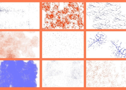
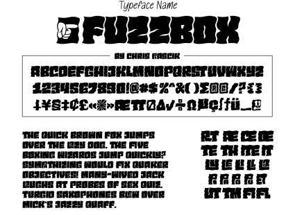
As part of the set, ‘Fuzzbox’, a chunky psychedelic typeface that looks like it crawled out of a '70s rock poster, features letters drawn to fit in a little grid shape, so they nestle together in an oddly satisfying way. ‘Delightfully Distressing’, meanwhile, is a matching analogue brush collection made from real ink, paint and textures that were further distressed digitally.
Chris Piascik said, “This collab with Envato made a lot of sense for me. I'm constantly making weird, gritty, offbeat assets for my own work, and getting to package some of that up to share with other creatives felt like a natural extension of what I already do.”
Designed for projects requiring more of a rough, hand-drawn vibe — album artwork, poster design, merchandise, and social graphics – these assets are designed for creatives to feel the texture and grit. The collection also includes a tutorial showing Piascik's creative process.
Our take
While there was a plethora of pared-down logos and brand assets in the mid-2000s (from Whistles to Starbucks), a backlash has been staged recently as Millennials reminisce about an era where McDonald’s had playful characters and free toys, and Pizza Hut felt more like a kitsch diner than a soulless ‘everyplace’.
Authenticity and self-expression are now dominating discussions, with bold, playful, and maximalist designs.
These allow brands to forge unique identities that resonate emotionally and stand out in a crowded digital landscape.
Indeed, Creative Moment has covered many of these, including campaigns like Heinz’s logo-less “It Has to Be”, which relies on cultural recognition, reflecting a trend toward customer-centric, distinctive branding.
Even associations are taking risks such as this retro campaign to 'save the rave', while McDonald’s has taken a more experimental bent in its campaigns of late.
I, for one, am up for a bit of quirk and novelty. Long live Chris Piascik and his ilk.
All images courtesy of Chris Piascik.
If you enjoyed this article, you can subscribe for free to our weekly email alert and receive a regular curation of the best creative campaigns by creatives themselves.
Published on: