

Election campaigns: can political advertising be creative?
It’s an election year. Can you feel the excitement? No, me neither.
But that’s not stopping the political parties from trying to get us excited with some good old-fashioned political advertising. It may only be February, but we’re already seeing an increase in attack ads - some good, some bad, and some, which have left me questioning why the committee behind them got out of bed that morning.
To save you the trouble of judging them, each month, Creative Moment is going to bring you a round-up of each party’s activity—picking apart the ads and looking for themes and patterns in how our beloved politicians use adverts and comms to influence the public.
Why would we do this to ourselves? We’re not sure. But it should be entertaining - and you never know, we might all learn something.
And where better place to start than the master of the political photo - the Lib Dems.
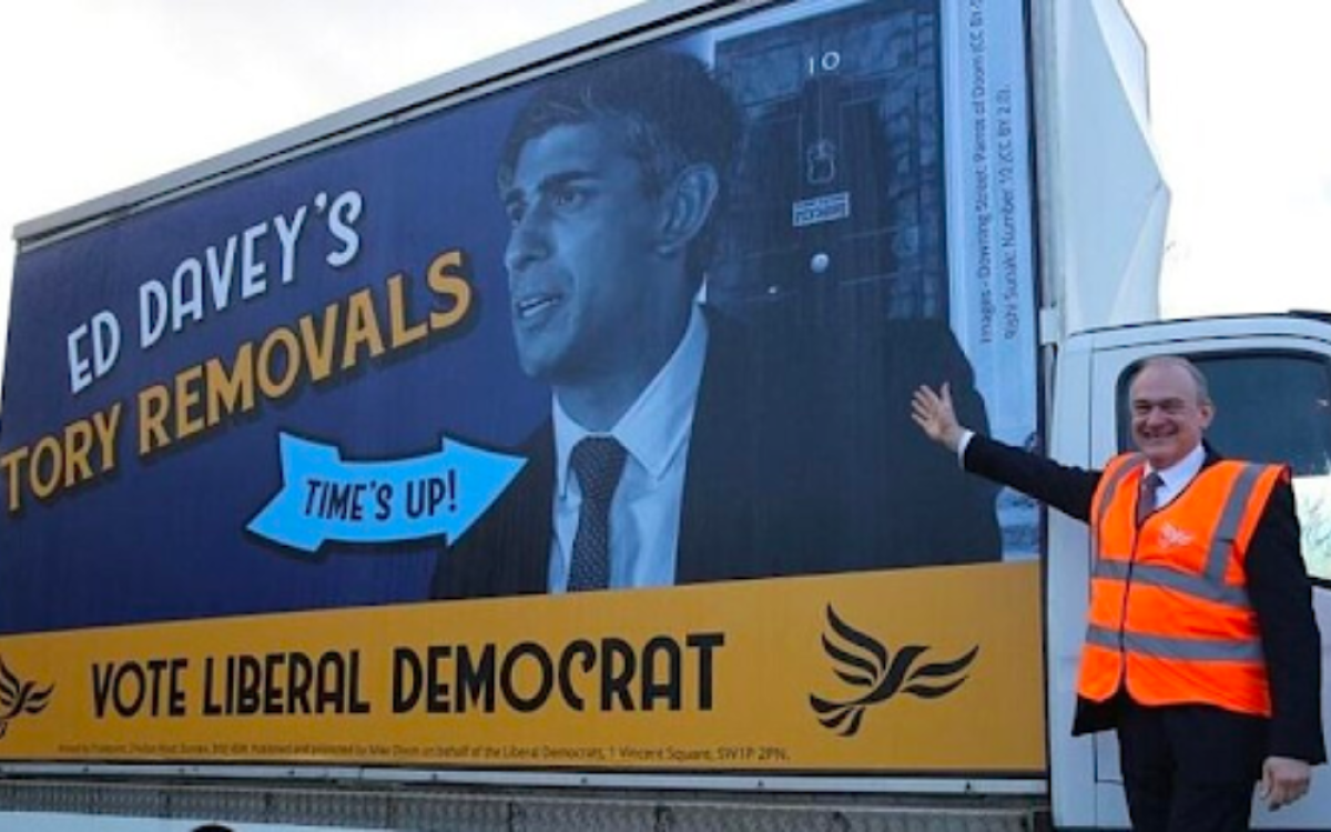
Lib Dems
I knew they wouldn’t let us down - it’s everything you love to see in one ad.
Vague cultural reference? Check.
Big CTA? Check.
Party leader in an awkward costume making an awkward pose? Check, check, and check.
Slight mocking of the composition aside, it’s a solid 6/10 ad.
Reminds the public the Lib Dems exist, reminds the political classes that they’re experts in winning seats off Tories in the blue wall, and gives the platform formerly known as Twitter a good laugh in the process. More of this please - because the other parties aren’t going to give us anywhere near as much fun.
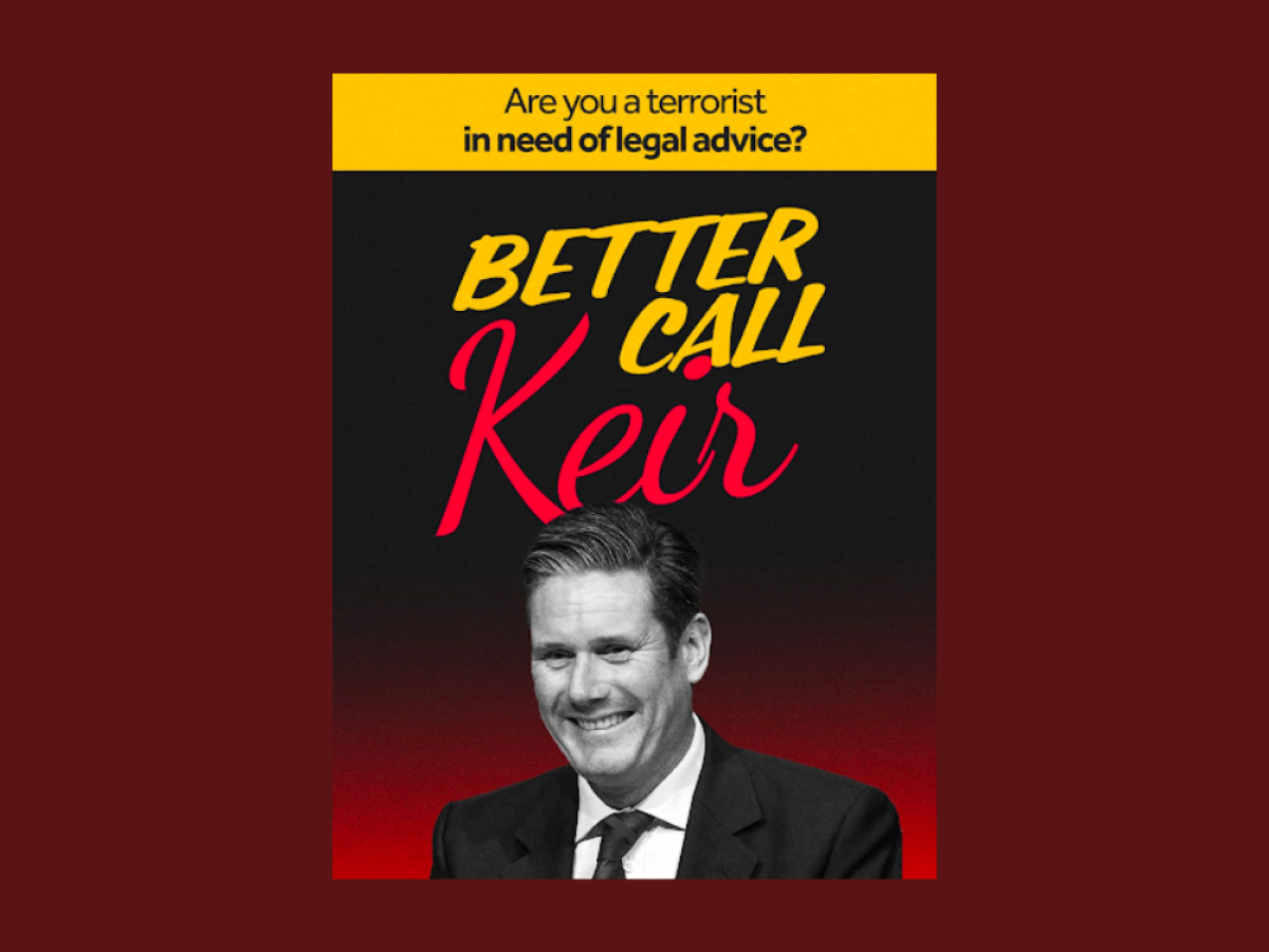
Conservatives
We’ve all had that client, right? The one who knows their brand is going down the toilet, so is willing to try something, anything, to change direction. The current Conservative party is that client.
In theory, there’s a simple strategy at play for the Tories - paint Keir Starmer as an out-of-touch wrecking ball who can’t be trusted with the economy. The execution…well, it’s a work in progress.
Where to begin with this beauty? We’ve got a fairly obvious cultural reference, some dark and disturbing colours, and the most sinister photo of Keir Starmer the designer could find. And there’s a CTA which makes a vague stab at landing the reference.
There are so many problems with this ad that I’m going to limit myself to two in the interests of our collective sanity.
The first is that Keir Starmer is too boring for this to have an impact.
The Tories and right-wing press have spent years trying to brand Starmer as extreme and out-of-touch for such crimes as giving money towards his Mum’s donkey sanctuary or knowing things about the law.
The trouble is, this doesn’t chime with the public’s image of him. The public thinks he’s a dull man in a dull suit. The more extreme the portrait of him, the less likely it is to land because it doesn’t fit with the average voter’s impression of him.
Secondly, none of the references are mainstream enough to be instantly shareable by the average voter. Better Call Saul is a critically acclaimed American legal drama series, but niche and, crucially, no longer airing. And I think the designer was referencing the infamous Demon Eyes poster the Saatchi’s produced of Blair. That ad is a classic - because it landed the key points of political advertising: be obvious, have mass appeal, and make an argument. Better Call Keir does none of them.
The efforts don’t end with the ad either. To complement the digital ads, the Conservatives attempted to manufacture a PR story and photo opp by having the PM brandish a legal textbook that Keir Starmer wrote on European Human Rights law.
Has there ever been a less exciting image than our PM holding a dense, dry textbook on Human Rights Law? It’s hard to think of one. And so it failed to cut through because the photo doesn’t tell a story.
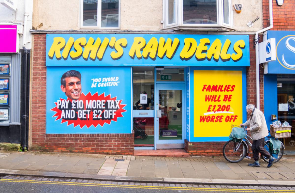
Labour
Labour have gone for the PR classic and have opened a ‘pop-up.
Not one you can actually visit, but that doesn’t matter one bit for the story.
Rishi’s Raw Deals tells a story that matters to the average consumer - Rishi is giving you a raw deal. Where it falls down is in having two stats competing for attention - this would work far better if they went all in one stat and were not worried about hammering home the message.
As for the design, well, the less said, the better. Clearly, they’ve tried to channel high street bargain stores and ended up with something straight out of '90s Microsoft clip art.
It feels like a decent but forgettable effort - something which will have got some shares on Twitter and likes on Instagram, but ultimately is just a warm-up.
So that’s February in political advertising.
What have we learnt? That 90s design is in fashion and more importantly - personality, not policy is going to define the early months of the election.
Join us next month to see how that plays out.
If you enjoyed this article, you can subscribe for free to our weekly email alert and receive a regular curation of the best creative campaigns by creatives themselves.
Published on: