


PizzaExpress is reinvented to revitalise its chilled pizza range
Independent design agency BRANDON and the British pizzeria group PizzaExpress, have launched a new retail brand identity for their iconic chilled pizza portfolio. Encompassing a new master brand identity, brand architecture and packaging design, the new visual identity imbues PizzaExpress’ 58-year history whilst refreshing its approach, empowering the brand to retain its place within the grocery market.
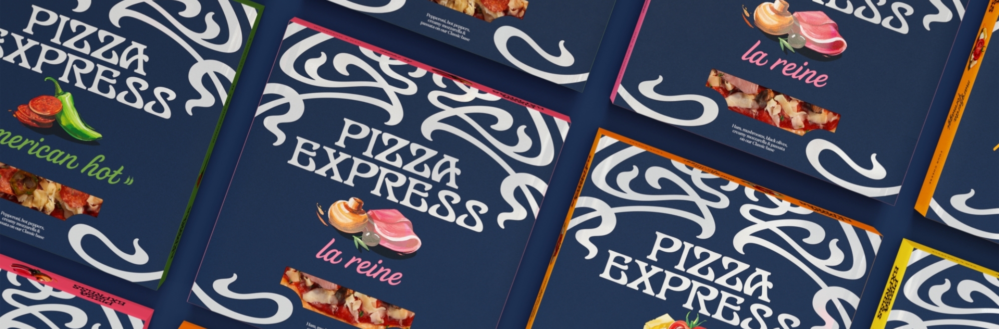
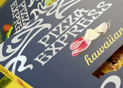
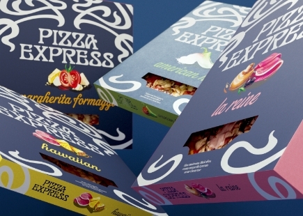
BRANDON reapproached the PizzaExpress product portfolio, developing three range tiers under a wider master brand identity, each range born from one of the brand’s iconic pizzas - Icons (American, Margherita, Sloppy Giuseppe), Restaurant Favourites (La Reine, American Hot, Hawaiian, Margherita Formaggi, Pollo American, Pollo ad Astra), and BRANDON’s aim through the design of each was to widen the occasions from every day, weekly use to special occasions, elevating PizzaExpress’ presence in the home and on the shopping list.
Joe Bembridge, design director, BRANDON, said: “By unlocking PizzaExpress’ unique and iconic place in our lives, we’ve successfully revitalised a much-loved nations favourite. We looked back into the PizzaExpress archive to help us move the brand forward, unleashing its creative flair from its jazz and art history. We simplified and amplified the iconic filigree mark, the brand’s strongest distinctive brand asset, then simply unified it across the product portfolio as part of a wider Masterbrand strategy.”
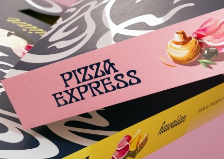
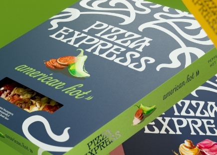
PizzaExpress is a long-held favourite in the UK, and with this in mind, BRANDON used the pizza artistry that is ingrained in people’s minds: the filigree logotype. Well known and recognised, the 56-year-old logotype was designed in 1967, by Italian designer Enzo Apicella. His ask was to replicate the aura of the first PizzaExpress; an image that has stood the test of time for over five decades. Using this iconic image, the agency asked lettering artist, Dan Forster to enhance the product descriptor typography, improving legibility at speed whilst leveraging the cusps and shapes of the key filigree distinctive brand asset.
Dan Forster, typographer, said, “The aim was to improve legibility on pack, and secondly, to echo cues from the iconic main brand marque, to create a more distinctive and ownable type style. A range of approaches were explored to find just the right balance of characteristics. The type was developed in a similar process to typeface design, with further adjustments made to individual characters to add more personality while also accommodating specific pack formats.”
Credits
Client: Pizza Express
Agency: BRANDON
Creative Director: Jonathan Rogers
Design Director: Joe Bembridge
Senior Designer: Lilly Parr
Account Director: Beth Johnson
Account Manager: Ailish Rossi
3D & Motion Design: Stuart Humphrey
Artwork Production: Graham Alexander
If you enjoyed this article, you can subscribe for free to our weekly email alert and receive a regular curation of the best creative campaigns by creatives themselves.
Published on: